Sunday, July 20, 2014

Art Studies

I've continued to do mostly studies about art, rather than making new paintings.  Work and home have demanded a lot of my time.  I've got a couple of new clients for my consulting business, and I'm trying to make sure they're happy.  And at home, a combination of ongoing projects and decent weather has required a lot of labor outside.  We had a new propane tank installed in the yard, which meant they had to dig a big hole to bury it, which required me to smooth over the ground, spread grass seed and fertilizer, cover it all with straw, and restore a stacked rock wall.  Sounds simple but it required a lot of time and I was a whipped puppy at the end.

So the studio has gotten short shrift lately.  I've used my limited time to work on several different studies.  One of them is landscape.  I've continued to go thru the landscape book mentioned in a previous posting, taking lots of notes, and learning a good bit.  One of my studio efforts was a cloudscape.  Here's how it turned out:


Great art?  Hell, no.  But it's paint on canvas and gave me a chance to work with the play of late-afternoon sunlight.  I've always loved looking at those big summer afternoon thunderclouds.  Sometimes the light catches them just right and stops me in my tracks.  But painting them is a difficult thing to do.  Painters work with a very limited range of colors that reflect light, whereas a thundercloud and the surrounding sky comprise an infinite range of colors and light.  With this particular study, I looked at how the range of colors in the sky (an ultramarine in the upper left corner, to a light green in the bottom right), as well as the range in the cloud (bluish purple shadows, light rose highlights near the bottom, gradually shifting to orange and yellow up high).  The mountains are, to me, a disaster, but that just shows what I need to focus on next.  Lots of lessons learned here.


I've been going to sessions with a model on Wednesday evenings.  Last week was my third session.  We had a lovely young lady who took a pose leaning against the wall.  She was very tanned and athletic, which gave her skin a rich warm glow, and the strong lighting gave sharp contrasts in light and dark.  I was pretty happy with the way this study turned out.  Titled "Megan Standing", it's now up in my Etsy gallery.  With this study, I put into practice some of the things I've picked up from my figure studies.  Specifically, I do an underpainting using only burnt umber.  This lets me work out the composition and light/dark structure.  Once it looks acceptable, I go in with a very limited range of colors.  This one used primarily yellow ochre and cad red, with a little bit of cobalt blue in various places, some ultramarine in the very dark darks, and a tiny bit of cad yellow in some of the highlighted areas.

Last week, I visited one of our local used-book stores and found a thick book on Anthony Van Dyke.  I never knew much about him, besides that he could paint a helluva fine portrait.  I've been going thru the book and studying the images, taking notes on the compositions, colors, metaphorical representations, and other things as they pop into my head.  My method of taking notes is to do a thumbnail sketch of the image and then scribble things down as they pop into my head, in a stream-of-consciousness way.  Here's a page from the notebook:


After this afternoon's session, I have quite a few things that I want to try out in the studio.  Lots of lessons learned, I think ... if I can remember them!


Thursday, July 17, 2014

Exhibit Review

Aperture Magazine published a review of the show I was in at Western Carolina University.  "Remote Sites of War" was a 3-man show curated by David Brown, the Director of the Fine Arts Museum there.  The other two artists were photographers Todd Drake and Chris Sims.  The show ran from April 10 to May 30 and the review was just published today.  Here's the link:

http://www.aperture.org/blog/remote-sites-of-war/

Monday, July 07, 2014

Early July Update

It's been busy times here since my last post.  Very little of it has to do with art.  We finally had our heat pump replaced.  That was a big deal, about 3 days worth of work for the crew from Bullman Heating and Air, but they did a really good job.  The new system pumps more air than the old, and it cooled the house down quickly, so we're happy.  The next stage will be next week when we have the propane guys come out and install a big tank.  Since our heat source in the winter will now be propane rather than electricity, it will be needed.

One of my business clients had a big project come up, and I spent about ten days going full-bore on it.  No studio time for this boy.  But we got it done and met the deadline.  And then I was able to catch up on other things.  Art, for instance.

As I mentioned in my last post, I'm going through another stretch of training myself in better painting techniques.  I had studied some classical figure painting techniques and applied them to a couple of copies of master paintings - one by Odd Nerdrum and another by Rembrandt.  Subsequently, I did a couple of life studies.  One will never, ever, see the light of day again.  The other was done from an old drawing session and it actually turned out okay.  Here it is:

Blue Shawl
Oil on linen panel, 20"x16"

This was done in a classical style, with warm underpainting and glazes on top.  I learned a good bit from this exercise.  The painting is now up in my Etsy gallery.

In addition to working on techniques for the figure, I'm also looking at landscapes.  This is a subject that I've typically avoided.  I don't do landscapes well, except for a very few that were really "portraits" of specific things.  And since I don't do landscapes well, I just don't do them.  But that's not a responsible attitude to have if I want to consider myself professional.  So it's time to learn how to up my game with landscape paintings in addition to figure paintings.

To that end, I'm overhauling my outdoor kit.  My French easel is permanently loaded now with a decent selection of paints, brushes, and other equipment.  And it's in my truck, where it's readily available when I can get away from work.  I've done some plein-air studies that, like the figure study mentioned earlier, will never see the light of day again.  But that's fine: you gotta whiff a lot of pitches before you start getting some hits.

And I'm doing some reading.  One of my plein-air painting friends told me to not worry about technique, just paint with passion and it'll happen.  Well, no, it doesn't, not for me.  I'm the kind of guy who needs a structured approach.  When I have no idea what I'm doing, and I'm winging it, the result has invariably been a disaster.  But if I understand the approach, then I can take deliberate risks with when and where to wing it.  And it generally works out better.  The result may still be a disaster, but at least I have an idea about what happened and can learn from it.

Oh, yeah, the reading.  I got the book Landscape Painting by Mitchell Albala.  I'm working my way through it and finding it to be quite good.  His style of working, from color choices to drawing to basic approach, is very similar to what I've already worked out for myself.  So I have pretty good confidence that the things I'll learn later will mesh with what I'm already doing.  Good stuff.

This doesn't mean I'm turning into a landscape painter.  Far from it.  But I do feel that I have to be reasonably competent in that genre.  So it's time to get to work and learn something.  Hopefully, by the time I make my next post, I'll have a landscape or two that are worth showing.  Or not.  Don't hold your breath.  But sooner or later, you'll see some here.  

Saturday, June 14, 2014

Studying the Masters

In my extremely limited studio time recently, I've been focused on learning better ways to put paint on canvas.  You may recall (if you're one of the 3 readers who've been with me a while) that last fall and winter, I stopped all new work and focused on re-learning the basics.  At least, high-quality basics.  I studied the techniques of several artists, took a workshop, got a DVD from a really strong painter, did some studies, and finally applied it all in a new painting, "Saddle Up", which was featured in a recent post.

A couple of things have blocked my development of new paintings.  Outside life events in general over the last month (the heat pump, the car, the cat, and lots of other nitnoid things) have demanded an inordinate amount of time.  The other is that my consulting business has been very busy in an unpredictable way lately.  Two clients have hit me with some very time-intensive projects.  Fortunately, they didn't come at the same time, but between the business and life events, I haven't been able to spend a sufficient amount of time in the studio to think about new works.

So I've focused instead on developing my techniques.  I got a new DVD on making a "classical" portrait from Robert Liberace.  The earlier one I got from him was on making an alla prima portrait - meaning a portrait done in essentially one sitting.  The "classical" approach is different in that it is done by carefully building up the painting in layers over a period of time.  This approach seems to fit my way of working: it's slower, more deliberate, and really rich when done properly.

Robert has an extremely well-developed sense of color, much better than mine can ever be, because my eyes just don't see color the way his do.  But that's okay, even very restricted color selections can have strong impacts.

Let me drop back a bit here.  For many years, I had no understanding of how color worked.  You mix one blue and one yellow, and you get a bright green; you mix a different blue and you get a dull green, and I never understood why that happened.  It was like I was supposed to memorize all the different color combinations.  Well, anybody that knows my memory knows that just won't fly.  Finally, in the mid-90's while studying at Maryland Institute College of Art, I was exposed to the book Blue and Yellow Don't Make Green, by Michael Wilcox.  At last, here was a reference that explained why mixtures made strong or muted colors.  Rather than making me memorize things, now I had a logical understanding of how to deliberately select and mix colors for specific effects.  Finally, I could paint!

But there were also some side effects from Wilcox's book.  (There are always side effects to everything.)  One was that my palette was now made up of a lot of strong colors such as cadmium red, cobalt blue, and phthalo green.  When you use strong colors, they tend to stay strong.  In painting a face, for example, your reds tend to be RED, your yellows YELLOW, and so on.  It's like driving your car with wild swings at the steering wheel and going all over the road.  Strong colors are great, but learning how to use them with subtlety is difficult.

In some of my studies recently, I've seen that many of the great artists used very restrictive color choices.  Sorolla, for example, used primarily yellow ochre, cadmium red, ivory black, and white.  Occasionally he used a small touch of a blue, but not often.  Yet he was able to achieve remarkable skin tones.  So I did a study using the Sorolla palette and, while the painting itself is kinda blah, I learned a lot.

The new Liberace video built on that approach.  While his colors were definitely more varied and stronger than Sorolla's selection, Liberace used them with restraint.  He mixed up a basic skin tone, then made a couple of variations on it, one warmer and the other cooler.  The differences in color temperature (meaning how warm or cool it is), value (how light or dark it is), and intensity were generally very small.  Certainly much smaller than my clumsy attempts.

I decided to put Liberace's approach into practice.  Rather than copy the painting from the DVD, I decided to copy an Odd Nerdrum portrait.  Here's how it turned out:


This was an interesting and fun exercise.  Nerdrum and Liberace don't paint the same way.  They use the same fundamentals (underpainting, layers of color, and so on) but their color choices and methods are different.  Liberace uses burnt umber for an underpainting, which is a warm muted brown.  Nerdrum uses a blue-black for an underpainting, which is much cooler.  Generally, blue is not a color you want in a face, but Nerdrum's is very muted and he makes it work. So, by using one painter's approach to copy another painter's portrait, I learned a lot.

In fact, I had so much fun, I did it again.  This time, I copied a Rembrandt self-portrait from the cover of The Rembrandt Book by Gary Schwartz.  Here's the result:


What I learned from this one is just how amazingly observant and good Rembrandt was.  There was no attempt to pretty himself up.  He showed all his wrinkles, pits, and sags.  There was no overstatement of anything - all his strokes are small, efficient, accurate, and lively.  As I was working on his forehead, for example, I was blown away by his attention to detail in each and every fold.  Usually, "attention to detail" in a painting means that it's way overworked and the artist should have stopped long before he really did.  Not with Rembrandt - with him, the detail provides additional support for the overall story in the painting.  My copy is just a poor cousin to the richness, vitality, and life in the original.

But still, my copy is a decent painting.  I learned a lot about subtlety, paint application, and a bit about "trusting the paint".  I'm going to make another copy or two.  And then I'm going to do some new paintings using what I've learned.  Can't wait!

Friday, June 06, 2014

Lament
Oil on canvas, 60"x60", 2006

"Lament", one of the paintings from my Meditation on War series, is now in a curated exhibition in Tipton Gallery in Johnson City, Tennessee.  The show is "Colors of Aspiration: The Flag in Contemporary Art".  As the curator, Karlota Contreras-Koterbay, stated:

"The exhibition features works by contemporary artists who employ the symbolic image of the flag to address social issues and its manipulation as visual dialogue.  The American flag has been a potent symbol of patriotism as well as powerful icon for social agency.  Artists, most prominently Jasper Johns, have employed the Stars and Stripes in various configurations and materials to pursue artistic ambivalence and encourage discussions in the nature of art.  The artists in the exhibition continue on this trajectory."

I painted "Lament" in 2006, when the wars in Iraq and Afghanistan were getting worse.  I was angry about how the administration had led us into two wars, and angry about how so many people callously disregarded the costs.  I wanted to make a statement that reminded people that, when you go to war, there is a tremendous cost to pay.  People die.  People get hurt.  Irreplaceable things are destroyed.

But people don't want to think of that at the start of the war.  Then, it's parades and speeches and a grand adventure where our boys are going to go kick the other guys' asses and be home in time for dinner.  Only it never turns out that way.  As our forebears learned in the Revolutionary War, and again in the War of 1812, and the Civil War, and the Spanish-American War, and World War 1, and World War 2, and the Korean War, and Vietnam, and any number of "police actions", it never goes as planned, and Johnny doesn't always come marching home again.

We need to be reminded of that anytime our politicians start talking about sending in military forces.  It's always, always, going to be worse than they say.


Monday, May 26, 2014

Of Cars and Cats and Broken Things

Real life has a way of interrupting all the things you really want to do.  So it has been for the past two weeks around here.

It started with a cat.  One of our neighbors had a cat that they never paid attention to.  They never took her to the vet, never gave her shelter, and never fed her.  Last winter, when we were down in single-digit temperatures, the cat showed up at our house looking underfed and desperate.  We were reluctant to take her in the house, but we made up a warm and protected shelter for her, fed her, and on the worst nights, brought her into the garage.  So she adopted us and we named her Bella.  But Bella was also pregnant (the little hussy).  Eventually, she had the kittens.  We never discovered where they were, but she would come visit several times during the day and wolf down huge amounts of food and milk, then run off to take care of the kids.

Then, about two weeks ago, Janis spotted a tiny little face peering out from behind the ShopVac in our garage.  I went over and discovered three tiny, scared little kittens.  A fourth was hiding behind some shelves.  Bella had brought her children over to her safe haven.  The little things were still nursing and a bit feral.  Eventually, though, they got used to us and began exploring the garage.  (Actually, they took over the garage: we have to park the cars outside so we can come and go without disturbing the kittens.  Lord knows you can't disturb the kittens.)


We tried to find homes for them.  We managed to place one, but that was it.  So last week, well after they had stopped nursing and graduated to hard food, I took three of them over to the Madison County Animal Shelter.  They were a huge hit.  I was worried about their future, but the staff (great bunch of people) assured me that cute little kittens like these are quickly adopted.  That was good news.  Meanwhile, we've still got Bella and are temporarily watching the one kitten who's been spoken for, just until her new owner can pick her up.  And when the remaining little one is gone, Bella's going to go to the vet for the first time ever so she can get her shots and get spayed.  No more kitties for us!


About the time the kitties showed up, our Volvo got rear-ended by a 93-year-old guy driving a Cadillac.  We were sitting in a long line at a stoplight and he just wasn't paying attention.  Wham!  The front end of the Caddy was destroyed and our Volvo took a pretty good licking.  Fortunately, nobody was hurt.  Unlike the old guy in the Caddy, we were able to drive away.  It's been in the body shop for a week now and (hopefully) we'll get it back tomorrow.

Our insurance company had us go to Enterprise for a rental car.  These guys were clueless.  Totally.  I made arrangements to pick up the car the day after the accident.  When I got there, they had no idea I was coming.  Then they gave me a Nissan Frontier that was identical to our own except 6 years and 30K miles newer.  We arranged to swap it for a car early the next week.  Again, when I got down there to swap it, they had no idea that I was coming.  This despite the fact that I had called them 30 minutes prior to let them know I was on my way!  Of course, they didn't have a car ready, and after about an hour, they wound up giving us a Jeep Wrangler.  Now I'm not big on Jeeps - I think they're rolling antiques at this point - but Janis loves it.  So we've been driving a Wrangler for the past two weeks.

As we were dealing with kittens and cars, we had another rude surprise.  Our 16-year-old heat pump died.  Our trusted heating/cooling guys had been telling us for maybe three years that we should be prepared for it to go, and it finally went.  So we brought 'em out for an estimate for a replacement.  Well, it wasn't so simple.  The original heat pump was built into the attic in a way that is extremely difficult to remove.  It really shouldn't have been up there in the first place as our attic has no airflow and is hotter than all hell in the summertime.  And the heating/cooling ducts to the back half of the house are too small and too long to allow for enough air to circulate.  The bottom line: the new heat pump needs to go in the crawl space below the house, where it'll be cooler in summer and warmer in winter, and where the air ducts can be most efficiently routed.

That's the right answer.  It's also expensive.

So we've been working on a home-equity loan to pay for the new system.  It's a royal pain in the keister.  Because it's tied to the equity in the home, they want to know everything.  Everything about the house, the land, our income, you name it.  An unbelievable amount of paperwork.  Fortunately, our credit rating is pretty strong.  We should get the "good to go" sign in the next couple of days, but it'll still be a few weeks before everything is signed, sealed, and delivered.  Ugh.

And while all this was going on, our mower broke.

On the positive side of the equation, I landed a new client for my consulting business.  So I've been working hard to ensure I get off on the right foot with them.  It's taking a lot (a lot) of time, but so far, so good.

But this means that I've been able to spend about zero amount of time in the studio.  I've had a couple of art developments, but will save those for an art-related post.  Hopefully, by then the kitten will be at her new home, our new cat will be spayed, our Volvo will be back from the body shop, our lawnmower will be back from the lawnmower shop, our loan will be approved, the new heat pump will be in the process of being installed, and my new client will be happy.

Maybe then I can spend a day in the studio.

Wednesday, May 14, 2014

New Paintings

I recently completed two new paintings and wanted to share them here.

Saddle Up
Oil on canvas, 50"x40"
©2014 Skip Rohde

Saddle Up is about a friend of ours, Pete, who was a Marine in Viet Nam.  Pete was in some really vicious battles during his two tours there in 1968 and 69.  When I interviewed him as preparation for this painting, he said that he was still fighting some of those battles at night.  His wife said he normally sleeps only a few hours.  I tried to capture that experience here.  Pete was the one who came up with the title.  "Saddle up, ladies" was the call to the Marines to head out on patrol.


After the Patrol
Oil on canvas, 24"x30"
©2014 Skip Rohde

After the Patrol was done from a sketch I did in Afghanistan.  A group of soldiers returned to our base completely worn out from their day conducting a village patrol in 120+ degree heat.  These can be nerve-wracking in the best of times because you never know when an IED might go off, or when insurgent fighters might open up.  You're a walking target.  And this sergeant had been in charge of the patrol.

I feel pretty good about both of these paintings.  I think both manage to capture the feelings I was looking for.  There are one or two other paintings in the queue right now.  Hopefully, it won't be months before they're done!

Saturday, May 10, 2014

Artists on Etsy

Last month, I wrote a post about establishing a gallery on Etsy.  Since then, I've continued to add to it, refine the listings, and actually sell a couple of pieces.  My gallery currently has 62 items and I'll add some more this weekend.

Some artists cringe at the thought of putting their work on Etsy.  It has an image of a craftsy place for hobbyists.  I've found that's not necessarily true.  While, yes, there are tons of people who are hobbyists, and frankly a lot of the work is about the level of a hobbyist, there are actually some highly talented and capable professional artists there as well.  We're talking about people with bachelors and masters degrees in fine art, teachers at some of the best art schools in the country (Rhode Island School of Design, for example), and many who are just plain good.

Etsy has a feature called a "treasury" list.  Members can put together a variety of "treasuries" of items that caught their eye.  I did one called "Outstanding Figurative Art on Etsy".  It links to really strong work by 16 different artists.  Here are some of them.


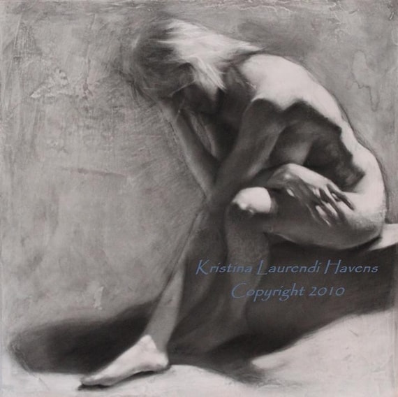
Kristina Havens does some beautiful classical figurative work.  She has an MFA degree and it shows in the quality of her drawings.  Kristina is actually the reason I've got an Etsy shop: she wrote an article on setting one up that was published in Professional Artist magazine.  It got me started on the project and I'm still following her advice.  Kristina's shop is Krystyna81.  She also has a blog.


I've been looking at Helen Gotlib's figure drawings for years.  This young lady really knows how to draw expressive figures.  And flowers, too.  She earned a BFA degree, has exhibited in solo and juried shows, and has worked the art festival circuit.  Her shop is HelenGotlib and her web site is helengotlib.com.


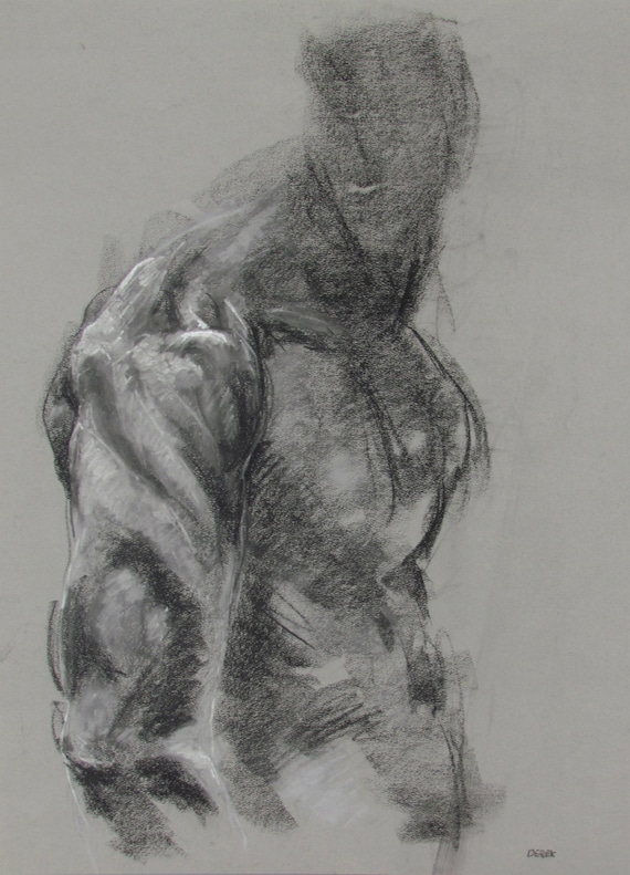
Derek Overfield is a beautifully expressive artist.  His drawings are gestural rather than classical, full of energy and power.  Derek, like the other two, has a degree in fine art, and has exhibited in numerous juried shows.  His Etsy shop is derekoverfieldart and he also has a website.


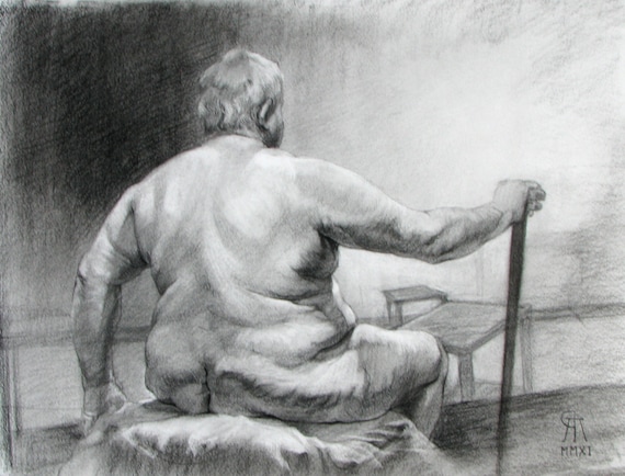
Rory Alan MacLean has a way with the figure.  This one, for example, is so strong and captures the weight and mass of the model beautifully.  He studied partly in the classical manner and also in school, earning a BFA.  I really like both his drawings on his Etsy shop (roryalanmaclean) and his oils on his web site.


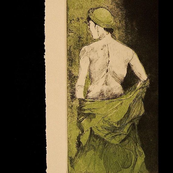
Ute Rathmann is a young lady in Germany whose work continues the spirit of German expressionists.  She has a very vibrant style with a great sense of composition.  I have no idea what her background is since her bio is in German, but it's clear that she's prolific and exceptionally skilled and talented.  She works primarily in drawings, etchings, drypoints, chine colle, and related media.  Her Etsy gallery is uterathmann.

So there are five of the 16 artists I've found.  If you like figurative art, go take a look at my list and browse through.  I guarantee you'll find something that will catch your eye.

Tuesday, April 29, 2014

Studio Progress

Welcome to Sarajevo
Oil on canvas, 24"x30"

My painting Welcome to Sarajevo is in the "Mayhem" juried show in Arlington, Virginia.  "Mayhem" is this month's exhibit at Gallery Underground in Crystal City.  The theme is mayhem and chaos of all sorts: conflict, domestic strife, burnt breakfast, rush hour traffic, you name it.  My painting is a quiet mayhem, the aftereffect of really violent actions, so it will be interesting to see how it is received.

Welcome to Sarajevo was an important painting for me.  It marked a shift from my political satire series to something that I hoped would be more significant.  The satirical paintings were fun to do, but there were two serious issues with them.  One, they required that I get really angry about something, usually about politicians who were running the country into the ground.  Getting angry was key to getting the vicious, snarky, and cutting commentary that came out in the paintings.  After a while, getting angry was just draining, and I needed to get away from it for my own sanity.  The other issue is that satire is very time-sensitive.  I found that a lot of the works were irrelevant after several months.  The issues changed, people left, and suddenly a painting that I worked on for weeks no longer had anything to say.

So I started the "Meditation on War" series.  War is, unfortunately, timeless.  It will always be with us in one fashion or another.  The paintings focus on the aftermath of combat, the things and people that are left.  The works were initially a counter to the rabid pro-war drumbeat that was part and parcel of the Iraq invasion.  If you want to go to war, you ought to think about what the consequences are going to be.  People die.  People get hurt in ways that affect them for the rest of their lives.  Stuff gets torn up, often stuff that can't be replaced.  Incredible amounts of money and resources are wasted.  And it always goes on for longer than you think it will.  I'm not anti-war or anti-military: there are times when we really do have to go to war to stop something worse from happening.  Desert Storm was an example.  But wars we don't have to fight shouldn't be fought.

It looks like I'll continue to do paintings for this series for quite a while.  I just started a new one today.  Didn't really mean to, but there it was ...

Yesterday I finished and signed the painting about my friend Pete, who was a Marine in Viet Nam.  It's done, finally, the first in my new series of paintings about survivors.  Now I need to come up with a title.  And also yesterday, I painted over the other artwork-in-progress from the survivor series.  It wasn't going anywhere except downhill.  Gotta start from scratch on something I've been working on since September.  It will get there, I just don't know how or when.

Thursday, April 24, 2014

DC Visit

I had a business trip to Washington, DC, last week for some meetings related to my consulting business.  I drove up on Monday - drove rather than fly because flying is no fun anymore.  Driving, at least for trips of up to maybe 10 hours in the car, is much more enjoyable.  No TSA screening, go at your own pace, no delayed or cancelled flights, much more comfortable seats, nobody with a cold sitting next to you (unless you take them along, in which case, it's your fault), stop when/where you want, big choice of places to eat, the scenery is much better, it takes about the same amount of time once you include the drives to/from the airport and waiting time, you have a car when you get there, and it's much cheaper all the way around.  To me, it's a no-brainer.

I had meetings on Tuesday through lunch, and then had time to myself, so I hit the National Gallery of Art.  It's one of my favorite places in the world.  And, of course, they were in between exhibits.  Not only that, but the East Wing is undergoing renovation, and everything there is closed.  Dang!  But the regular galleries in the West Wing were still open, so I wandered through them.  As usual, I had my sketch pad with me and made a lot of quick sketches with notations.  To me, a good art museum is a great learning tool.  I see how the really good painters created their works, and I can try to transfer that knowledge into my own.  However, I find that I keep re-learning the same lessons.  Here's what I noticed this time:

  • Accurate but loose drawing.  The masters make it look easy: their brushes quickly describe the form.  Their proportions are spot on, the brushwork is loose, and it looks like it was effortlessly done.  Right, just like an Olympic figure skater's moves are effortlessly done.
  • Small areas of strong color against large areas of muted color.  At least until the Impressionists, this was true, especially for people like John Singer Sargent and James Whistler.  The muted colors provide the setting for the richer colors to sing.  Actually, this is a good metaphor.  Think of a music band: most of the musicians are providing the beat, the underlying melody, and supporting vocals, while the singer or lead guitarist (or whoever) works their magic.  Bright color against more muted colors does the same thing.
  • Most edges are softer.  This is a subtle thing that most non-artists miss.  Look at the edges of the forms and most edges are soft, or slightly blurred, and some are lost altogether.  The hard edges will be found where the painting's center of interest is.  Our eyes are drawn to brighter colors, harder edges, and higher value contrasts (light/dark contrasts).  So artists use more muted colors, softer edges, and lower value contrasts in the supporting elements, and the opposite around the focus.  I try to as well, but my natural tendency (like most people) is to try to delineate every individual thing very clearly.  So this means harder edges and more detail and development than is usually needed.  Save that for the main item.

Here's a clip from my sketchbook.  I found Rembrandt's self-portrait and found it incredibly moving and powerful.  In my opinion, one of the finest portraits ever painted.


This is a typical set of notes from studying a painting: a quick sketch, some identifying information, and then notes on what I see as to how it was painted.  In this case, the painting was done with muted colors and soft (or lost) edges everywhere except the face, which was richly colored and done with thick swirls of paint.  Rembrandt's focus was on the eyes.  They were the most defined section of the painting, and the sheer intensity and humanity in those eyes is astounding.  Here is a man at his rawest: capable, vulnerable, successful, and a failure (he was financially ruined at the time of this painting).

I saw artist easels in most of the rooms.  Man, I would love to be able to spend time in there, making copies of some of those paintings from the real thing rather than a photo in a book!  The difference is huge, even in a high-quality reproduction.  The real thing has subtleties that you just don't see in a reproduction, I don't care who makes it.  So what would I copy?  Rembrandt's self-portrait.  Anything by Sargent or Whistler.  El Greco's "Laocoon" or "View of Toledo".  Velasquez.  A good Raphael Soyer.  A dozen others ... and those are just the ones I saw that day.

On Wednesday, I had another business meeting in the morning, and in the afternoon I went to the Museum of American Art.  More drawing from amazing paintings.  A painting by John White Alexander of a woman backlit in front of a window was stunning in its handling of light.  A huge, mural-sized painting by Thomas Hart Benton was complex, carefully structured, and full of life.  A Sargent painting about knocked me out.

Needless to say, I was a happy man!

So that was DC.  Next I went to Baltimore to visit my aunt and cousin.  We had a great time, as always, and I love visiting with them.  While I was there, I went down to Maryland Institute College of Art, or MICA.  I was a student in MICA's continuing education program back in the mid-90's.  Now, three of my fellow UNCA students are teachers there.  One of them, Paul Jeanes, invited me to come talk to his class.  As I've noted here before, this sort of thing really energizes me.  I focused my talk on how my work has developed since graduating, including how it was affected by my Iraq and Afghanistan deployments.  The students were very interested and asked lots of really good questions.  Only a couple of them went to sleep.  I wound up talking with them for far longer than planned, but we were on a roll, so it was all good.  And I got to see one of my teachers from way back when.  Michelle LaPerriere is still teaching there, and it was really wonderful to see her again.

All in all, a great trip.  And now, four days after getting home, I'm still not caught up on all the work, home, art, car, and other things that have been lying in wait for me.  Maybe next week ...


Wednesday, April 09, 2014

Lots of Shows!

When shows come, they seem to come in bunches.

Right now, I've got two paintings in a curated exhibition at Tipton Gallery in Johnson City, TN.  The show is "EQUAL: Modern Family in Contemporary Art".  My two contributions are Pleasantville and The Dancers:


Both of these have been around for a bit.  Dancers was painted in 2003 and Pleasantville in 2007.  Both have been sitting on the rack in the studio for too long and needed to get out in public again.  The exhibition is pretty good and one work in particular knocked me out.  Laura Chenicek's tiny piece No Matter How Hard I Tried is easily described: it's a small broken eggshell that has been sewn back together with silk sutures.  As an artwork about the fragility of relationships, it is extremely powerful.  Click on the link and take a look.

I'm in another show that opens tomorrow at the Fine Arts Museum at Western Carolina University.  "Remote Sites of War" is a curated 3-man show featuring my drawings from Iraq and Afghanistan, photographs of Guantanamo Bay and military training by Christopher Sims, and photographs from Palestine by Todd Drake.  It's quite a strong show.  The museum director, David Brown, arranged all my drawings on one wall:


I really like the effect.  There is a definite rhythm to the layout and it kept pulling me along.  I went down there today to speak to a history class about my experiences in Afghanistan.  Rather than just talk about pictures or events, I tried to talk about the complications and contradictions behind simple images of people, with the message that they need to be aware of unseen complications in their own lives.


So I'll be back at Western tomorrow for the show's opening, then again on Monday to speak to two other classes.  I really enjoy these talks.  

And I learned that I'll be in another exhibit at the end of the month.  My painting Welcome to Sarajevo will be in the national juried show "Mayhem" at the Gallery Underground in Crystal City.  The show will run from Apr 28 to May 31, with an opening reception on Friday, May 2, from 5-8 pm.


So there you have it.  I've been busy as hell with a lot of other things, too, but they can wait for another post.  Meanwhile, if you're in western North Carolina, go see the "Remote Sites of War" exhibit at WCU.  And if you're in the DC area, go see "Mayhem" at the Gallery Underground in Crystal City!

Friday, March 28, 2014

Mark Meadows Follow-Up

Back on March 2nd, I wrote a post titled "Mark Meadows and the Ukrainian Crisis".  I had received an email-to-the-peasantry from Meadows, my congressman, in which he lambasted President Obama for his handling of Russia and the Ukraine.  Like most of his fellow Republicans, Meadows called for more forceful and imaginative leadership.  I wrote a note back to him, asking him what, exactly, he would do.  Boots on ground?  Air strikes?  Something else?  Frankly, I never expected to get a reply.

Well, I was wrong.  He did reply today, 26 days later.  Or one of his minions did, anyway.  In an email, he laid out the forceful and imaginative leadership that he would provide.  His actions were:
- a House Resolution that "condemned the violation of Ukrainian sovereignty, independence, and territorial integrity by military forces of the Russian Federation."
- Boycotting the G-8 summit in Sochi.
- Convene a G-7 summit somewhere else and expel Russia from the G-8.

Yes, that's pretty forceful and imaginative.  It also mirrors what Obama has done.  Well, Obama can't pass a House resolution, but he worked with the EU, NATO, and the G-7 partners to boot Russia out of the G-8 and convene an alternative summit.  He's also got the Secretary of State and State Department diplomats worldwide working on isolating Russia, imposing increasing levels of sanctions, and shifting Europe away from Russian sources of oil and gas.  In other words, he's doing far more than Meadows ever thought of doing.  So much for Meadows' diatribes.

The United States is not in a position to take hard military action.  It would be stupid.  Frankly, the Ukraine and Crimea do not rank very high on American strategic interests.  It makes little or no substantive difference to us whether Crimea is ruled by Russia or the Ukraine, and it is not worth one single American soldier's life to try to change it.  We can, and should, bring pressure to bear on Russia to quit behaving like a thug and more like a respectable member of the international community.

Over the long term, however, Putin's actions are only going to hurt Russia.  The Crimean economy is in the toilet and will require significant economic support from Russia.  International sanctions are having an immediate impact now.  Most of it is psychological: the Russian rich are seeing their country losing its economic standing.  The longer-term impact will come from the international community's negative views of the country.  Who wants to deal with a thug?  Those former Soviet-bloc countries who have established ties to the West see a rising Russian threat, so they're going to establish closer ties to the West as protection.  Meanwhile, the primary Russian exports are natural resources: oil and gas.  They're not making much money of their intellectual capacity.  That's a description of a third-world economy, not a world leader.  And Putin is to blame.

In the short term, Russia will beat its chest and roar at the world, but it can't really do too much.  In the long term, the Russian bear is pretty sick, and Dr. Putin isn't providing it the help it needs.

So Meadows and his friends in the House will squawk like hawks.  They really don't have much, if anything, to add to the debate.

Wednesday, March 19, 2014

Life Drawing, Short Poses

I go to several different life drawing sessions around Asheville.  There's one, on Monday evenings, that is unique in that it consists entirely of short poses.  By "short", I mean one to two minutes, with maybe three 5-minute poses at the end.  If you've ever done life drawing, you know that's not much time.  You have to work fast and get it right the first time.  If you don't, well, just wait a minute and start a whole new one, because there's no going back.

Here are a few drawings from Monday's session.  We had one of my favorite models, Amy, who is a beautiful young lady and really good at twisting herself into great poses.  This was a very fun session.

I've put these four drawings up on my Etsy store - have a look!.


Saturday, March 15, 2014

Etsy Shop

Ever feel like you're one of those performers who get dozens of plates spinning on poles?  And you're running from pole to pole, trying to keep all those plates spinning without crashing to the ground?  Yeah.  That's me.  Between my consulting work, trying to make progress on the "Survivors" paintings, taking care of house and car maintenance, going to life drawing sessions, working on my taxes, yadda yadda yadda, there seems to be a net negative amount of time in the day.

I know: waaah.  I'm whining.  Deal with it.

One of the things I've been working on is setting up an Etsy shop.  It finally opened last night.  Here's the link to it:
https://www.etsy.com/shop/Metis21Studios

There's not much there yet.  Heck, I just got it set up, give me a break!  I'll eventually have original paintings, drawings, etchings, pastels, watercolors, photographs, as well as lower-priced prints and cards on the site.  It'll take some time to get it up to full speed.  But it went live about 11 pm last night and already has a number of people who've "favorited" it.

They advertise that setting up an Etsy shop is easy.  Well, kinda sorta.  Stepping thru the setup process is easy.  Stepping thru the process while doing a professional job the first time around is not.  I looked at a lot of Etsy stores to figure out things like presentation, shipping, policies, price levels, what to say, what not to say, what to have photos of, photo preparation, what tags to use, you name it.  Then I had to learn how to get what I learned into my store.  Then I had to learn how to change it when the first try was unsatisfactory.

But I got there.  I think.  It looks pretty good, although a bit sparse for now.  I'll continue to prepare more new items and post them.  Take a look and let me know what you think.  I'm always, always, open for constructive comments.

Sunday, March 02, 2014

Mark Meadows and the Ukrainian Crisis

My congressman, Mark Meadows, is a Tea Party leader.  He sends out "weekly" reports every once in a while, especially during election season.  Most of these emails boast about Mark's supposed great deeds of the week and attack Democrats for not agreeing with him.   The latest is no different.  Mark is a member of the House Foreign Affairs Committee and attacked the administration over Ukraine.  He stated, "Unfortunately, the Obama administration continues to demonstrate a lack of leadership in refusing to address aggressors around the world. In my role on the House Foreign Affairs Committee, I will continue to monitor this situation alongside my colleagues and encourage our nation to stand against Vladimir Putin's dangerous power grab and clear disregard for international laws."

I just sent him a note about that.  Here's what I said:

"I just read your weekly update in which you criticized the administration for its handling of the Ukraine crisis.  Can you tell me what, specifically, you would do?  Your words were a vague statement about "standing against Vladimir Putin's dangerous power grab and clear disregard of international laws".  How is this any different than the Administration?  Would you intervene militarily?  Would you launch air strikes against a nation with first-rate anti-aircraft defenses?  Would you put boots on the ground in a hostile country?  What, specifically, would you do?

With the election season coming up, the answers to these questions are extremely important.

Regards,
W. E. Rohde"

I'll let you know what he says, if one of his staffers ever bothers to answer.  I'm not holding my breath.

Thursday, February 27, 2014

Update on the New Painting


The composition is now blocked-in.  Now to let it sit for a week or so to dry enough to support layers of glazes, scumbling, and painting over the top of it.  

Saturday, February 22, 2014

New Painting Underway

For the last couple of months, I've been re-learning and re-inventing how to put paint on canvas.  The way I was painting last fall wasn't expressive enough nor (frankly) good enough for my new series about survivors.  It was too timid, careful, and overworked.  So I put the series on hold while I figured out a new approach.  And now I think I have one that's appropriate for at least the first piece.

This new painting is about a friend of ours who was a Marine in Vietnam.  He was in some brutal battles and carries the physical and mental scars to this day.  When he told me that he's still fighting some of those battles nearly every night, I knew that was going to be the focus of this painting.

Getting from the concept to the composition was a long process.  I went through piles of drawings, trying out different ideas and combinations of ideas.  Then there were several color studies to wrestle with lighting, values, and color combinations.  All the while, I was working on a new (for me) way to put paint on canvas.  Eventually, I came up with a composition that best expressed the basic idea:

Color Study for "Pete"
Oil on paper

Last week, I built, gessoed, and toned the canvas.  Today was the day I finally - FINALLY - started putting it all together.  Here it is on the easel, with the color study and drawings next to it.  


And here's a detail showing how it sits on the easel right now:

Detail of "Pete" in progress
Oil on canvas

I'm really happy with the way it has started.  Once I got warmed up, getting this part roughed in was a lot of fun.  Now to keep the momentum going, stay loose, and not overwork it.  

Thursday, February 13, 2014

Colors on the Palette

As I wrote about last month, I've been trying to revitalize my painting techniques.  One important aspect of that is the feel for color.  I haven't been happy with the way I select which colors go on the canvas - I've been too tentative and too literal, and that has carried over into the way the final painting is perceived.

So a while back, I got an instructional DVD from Robert Liberace.  His portraits had really struck me with their liveliness and energy and I wanted to see if I could pick up on that.  Liberace uses a much larger selection of tube colors than I do, and he uses the colors in very imaginative ways.  So I added some new colors to my palette, played with them in some small paintings to test the concept, and learned some new stuff.  But his colors and techniques are not something that I can fully follow.  Besides just being different artists, my color vision is not as sharp as his.  It's common for men to have some color perception difficulties, and I suffer from that.  You know those color tests where they show you a card with lots of colored dots, and you're supposed to see the number?  I've never passed that test.  But the funny thing is, I can mix up paint to match any of the colored dots.  My difficulty is in seeing differences in adjacent colors when they are the same light/dark value.  That's kinda important when you're a painter, particularly one who uses a wide spectrum of colors.  So while I learned a lot from Liberace's video, I will never be able to match his color sense.

A couple of weeks ago, I participated in a workshop with the painter Steve Huston.  He considers himself a tonalist painter and uses a more restricted palette of colors with many standard colors like ultramarine blue, alizarin crimson, and burnt umber.  But where Liberace would pull in, say, violets and greens and rose, Huston relied more on controlling the light/dark values and only slightly adjusting the basic color.  It was a very different approach.  Both artists, though, have very lively brushwork, and both have very similar approaches to the initial block-in and early refinement stages of a painting.

This evening, a friend of mine posted a link to a blog post about Anders Zorn.  Zorn was a Swedish painter, a contemporary of John Singer Sargent, and painted in somewhat similar style.  What was really interesting is that Zorn primarily used an extremely limited palette of yellow ochre, cadmium red medium, ivory black, and white.  That's it.  Yes, he used some other colors, like cerulean blue, on occasion, but normally he just used those four.  Yellow ochre is a muted yellow, cadmium red medium is a strong but controllable red, and ivory black is a cool dark blue.  So all three primary colors are included, only with very muted versions.  I'm going to have to do some color charts using those colors and see how they turn out.  For a more in-depth discussion of the palette and how it works, see Michael Lynn Adams' blog post.

I thought I'd seen a similar palette before, and after a bit of looking, I found it.  Odd Nerdrum, the great Norwegian painter, gave a portrait demonstration in New York a couple of years ago, and he used yellow ochre, Chinese vermilion, Mars black, and titanium white.  It's almost the same as the Zorn palette.  Nerdrum's painting style is very different from Zorn's - it's more closely related to Rembrandt's - so the end result is very different, but it's interesting that two painters who are so damn good use such restricted choices of colors.  Nerdrum's demonstration is described in Matthew Innis' blog post and is well worth reading.

One other artist with a limited palette came to mind: Lucien Freud.  Looking at his paintings, you can see that he relied heavily on earth colors (yellow ocher, burnt umber, burnt sienna) with limited use of brighter colors.  I wasn't able to find a technical discussion of his actual color choices, though.

So my plan of action is to do some color charts using the Zorn/Nerdrum colors and then try some portrait studies.  I'm thinking that a restricted palette could be helpful to somebody who's color-vision-challenged like me. At the same time, the color techniques that I learned from Liberace would be good things to have in the back pocket to use when necessary.  And the only way to find out if all that is true?  Try it out!

Sunday, February 09, 2014

Catching Up

The weekend after my last post (about the radio interview with Marilyn Ball), I took an online workshop from the painter Steve Huston.  I'm struggling with finding an appropriate style of painting for my new "Survivor" series and Steve's work appeared to offer some ideas.  The workshop was hosted by the New Masters Academy (NMA) in Newport Beach, California.  This was their first foray into streaming a live workshop.  The workshop was scheduled for 8 hours a day for 3 days.  I wasn't sure about how useful the workshop would be, especially since I'd be at home on my computer instead of slinging paint in the studio, but decided to give it a go anyway.

As it turns out, the workshop was very valuable.  Steve talked a lot about drawing, building the figure, composition, painting techniques, and much much more.  He did demos from a live model, and the NMA staff posted photos of her so those of us online could draw as well.  She was a lovely young lady whose poses, unfortunately, were the most boring and uninspired that I've seen in a long time.  Maybe I'm just spoiled by the outstanding group of models here in Asheville.  But Steve's thoughtful discussions and demonstrations were invaluable.

As this was the first time the NMA had done such an event, I expected to see some glitches, and there were.  But they fixed them quickly, and by midway through the first day, everything went extremely well.

The NMA is continuing to develop more online workshops, and they already have a lot of recorded courses online, by Steve and others.  I was impressed with the group.  Take a look - you might be, too.

During the next week, I went back through my notes (22 pages of them) and sorted them into something that would be easier to use and follow.  And I spent a good bit of time in the studio to try out some of the ideas.  Lots of other stuff was happening around the house, so I didn't have time to update this blog.  But I have a lot of things to share from that workshop.  I'll do that in my next blog post.

Then last weekend, my uncle passed away.  He was 87.  He went into the hospital for some relatively routine heart surgery (as if any heart surgery is "routine"), but then had cascading complications that couldn't be stopped.  On Monday, I drove down to Corinth, Mississippi, to attend the funeral.  Despite the circumstances, it was great to see my cousins again.  We haven't all been together in one place in over 35 years.  Like many families these days, we're widely scattered: Colorado, Tennessee, Florida, Mississippi, North Carolina, and New Mexico (where my sister, who wasn't able to attend, lives).  There were spouses and children that I'd never met.  We spent long hours together, talking and catching up, telling stories on each other, getting to know those we just met, and sharing the grief of losing my uncle.

My uncle, by the way, was an amazing man.  He was a scout for Patton's army in World War II.  Subsequently, he earned a bachelor's degree from Ole Miss, a law degree from Tulane, and was a Rhodes Scholar in Cambridge, England.  He could've written his own ticket at any big-league law firm anywhere in the world, but he returned home to the small city of Corinth to practice there.  He was a leader in the First Baptist Church, a lifelong board member of the YMCA, coached YMCA baseball for over 20 years, served as the attorney for a variety of local government organizations, served as Director of the Chamber of Commerce, taught Sunday school, and was President of the school board.  At the same time, he and my aunt raised four wonderful kids.  I remember him as a very gentle man with an easy laugh and all the time in the world for us kids.  Uncle Jimmy will be missed.

After the funeral, I went to Memphis to visit my parents' graves.  I also visited with Persi Johnson, my first art teacher.  Persi is pushing 90, but her mind is as sharp as ever, and she has lost none of her feistiness and wit.  Visiting with Persi was a treat.

It's kinda sad, isn't it, that sometimes it takes a death to make us realize that we really and truly need to take the time to be with our close friends and relatives more often.  I had been meaning to get to Corinth and Memphis for years to visit with Uncle Jimmy, Persi, and my cousins, but never got around to it.  Now it's too late to talk with Uncle Jimmy again.  But I can still talk with my cousins.  And I will.

Wednesday, January 22, 2014

Radio Interview

Last week, I was interviewed by Marilyn Ball for her Speaking of Travel show on WZGM 1350 radio.  I'd never been interviewed live before and was a bit nervous.  Some of you have had that experience: suddenly a microphone is right there in front of you and you're speaking to God knows how many people, and all you can think of is "...uuuhhhh ...".


Marilyn, though, was a great host.  She quickly put me at ease and it felt like just the two of us sitting around shooting the breeze.  Only with a couple of microphones between us and an eagle-eyed producer watching the clock.  In Speaking of Travel, Marilyn talks to people about their experiences traveling around the world.  She asked to interview me because I'd been an artist, then gone off to Iraq and later Afghanistan, and come back to be an artist again.  I mean, doesn't everybody do that?  No?  Okay, so I'm a bit odd.  Perfect material for an interview subject.

The interview aired on the radio this afternoon, and the podcast became available here.  It's 20 minutes long.  Have a listen!

Sunday, January 19, 2014

Looking at Artists: Steve Huston

I love it when I find an artist who knocks my socks off.  Today I found just such an artist: Steve Huston.  This image of one of his paintings-in-progress showed up on one of my friends' Facebook pages today:

Haul (in progress)
Oil on canvas
© 2014 Steve Huston

The vibrancy and strength of this work-in-progress is really impressive.  You can feel the weight that this guy is putting on the line, and feel the push in his legs.  Every line is correct, yet every line is vigorously done so that each has strength and character of its own.  

Once I got over the immediate visual impact, I looked at how he might have done this.  I believe that he toned the canvas with a muted yellow.  Hard to tell from a jpeg image, which almost certainly looks very different on my computer than it does in person, but he might have used yellow ochre and/or orange with a good bit of white to mute it.  Then he let it dry completely.  Next was to rub a muted red wash over the whole thing (maybe a terra rosa toned down with a green?).  The torso was then drawn by wiping out the highlights, and the jeans and shoes drawn with a brush and a very dark, almost black, mixture.  The torso, head, and hair got some additional paint added to establish solidity and color.  So now I'm going to give this approach a try.

Then I looked up Steve's web page, starting with his paintings.  Turns out that almost all of his paintings have this sort of strength.  His subjects are frequently working men, like construction laborers, heavily muscled in a working-man way (as opposed to bodybuilders with their exaggerated physiques).  Others are club fighters.  A few are females.  All have great energy and presence.  

In addition to his web page, Steve also has a Facebook page.  Go take a look and see for yourself.  This guy's good.

Friday, January 17, 2014

Learning How to Paint ... Again

Back in early December, I wrote about starting a new series of paintings about survivors.  This new series is kicking my butt.  As I mentioned then, at least some of the paintings require a very different way of painting than my normal style.  That style is kinda quiet and descriptive, and lets the subject matter carry the story.  That approach doesn't work here.  My survivors are people who've been through some really bad, often violent, situations.  You may not know it if you ran into them on the street - they're regular people doing regular things, but it underlies who they are today.  So painting them in a regular style completely misses the thing that they've survived.

I've been working on some oil studies: small-scale paintings of the compositions of the first two subjects in this series.  The point was to see what worked and what didn't.  My basic compositions worked well, with just some minor tweaks.  But how the paint was applied was all wrong.  It was tentative, careful, and way over-worked.  The paint itself gave no indication of the depth of the underlying story.

And while I was at it, I realized that my color-mixing, color-choosing, and basic painting skills seem to have gone downhill.  I've been too busy lately with my consulting business and it shows.

How to fix that?  Well, I've talked with other artists about their processes, particularly some who work in a manner that I think is more appropriate to these stories.  I've tried to get some idea of how they work, to see what can be applied to my series.  And I'm copying some other paintings, trying to get the flow of the paint, and feel it right down in my muscles and not just in my head.  Painting is something that you need to internalize to where it's almost automatic, so you can think about the important things and let the thoughts and feelings flow through your arm and through the paintbrush onto the canvas without interruption.

Last year, I got DVD of an alla prima portrait demonstration from Robert Liberace, an exceptionally talented artist.  I reviewed the DVD and wound up copying (more or less) his demo as a way to understand his color choices and to loosen up my own paint handling.  Here's what I came up with:


No, I'm not claiming this is great art, it's a copy of somebody else's work.  But this exercise was really useful as a learning tool.  There's another artist that I've been looking at and I'll copy one of his in the next day or two.  Meanwhile, tonight I went to an artist talk at UNCA and came away with some other ideas on what I can do to help get the effects needed.

I'm frustrated that I've been trying to get this series started for months now, and haven't even put a brush to the real canvas yet.  But there's no sense in doing that until I have a good idea as to how to proceed.  Patience, grasshopper, patience.

Tuesday, January 14, 2014

Life Drawing Again

Last night, I went to a life drawing session at David Lawter's studio in Asheville.  David's Monday night sessions are unique in this area.  All the poses in this 2-hour session are short.  Really short.  We start with 1-minute poses then go to 2 minutes, and end with 5 minutes.  Most other sessions around here start with a 5-minute pose as a "quick" warm-up.

I find these short poses to be a heckuva lot of fun.  They're a challenge: you have to get it right, right away, because there is no going back.  Before you're ready, the buzzer has buzzed and the model is on to a new pose.  Deal with it!

Our model was Amy.  This young lady is a real live-wire.  She looks like Marissa Tomei and is bubbly, energetic, creative, and so much fun to work with.  These short poses really suit her.  She squirms around until she's contorted into some really difficult position, and then holds it like a rock.  The short poses let her get into incredible positions that are really impossible for anything longer than five minutes.  So the combination of short poses and Amy's creativity meant that we had two hours of some really challenging drawing.

So here are a few pages from my sketchbook:


Can't wait for next week!

Tuesday, January 07, 2014

Lost in Translation


Janis was going through some old memorabilia and found a lot of stuff we'd completely forgotten about.  One of them was an article that I'd written for my last Navy command's newsletter.  I was stationed at the Naval Security Group Activity in Misawa, Japan, in 1998.  And yes, that was my official photo - don't you just love the Harry Potter glasses?  And that stern look.  What a faker!

Most officers tried to write "inspirational" op-ed pieces that nobody ever read.  I just said to hell with it and wrote about whatever caught my fancy.  This particular piece was about how both the Japanese and Americans butchered each other's languages.  Here 'tis:

--------------------------------------------------------

One of the neat things about serving overseas is that we get to murder somebody else's language and they, in turn, get to murder ours.  Both sides seem to do a pretty good job of it, much to their mutual amusement.

When I first arrived in Misawa, I was entranced by the names of the cars.  Where else but Japan could you find a real Bongo Wagon?  For those of us of "a certain age" (that means us old folks), bongos conjure up visions of half-trashed VW Vans with flowers painted all over them.  Another great name was the Toyota Super Casual.  Not just regular ol' laid-back casual, mind you; we're talking comatose here!  For me, the overall winner was the Nissan that featured "Viscous LSD".  Where's DEA when you need them?

Car names were only the beginning.  As I wandered around off base, I noticed more and more interesting phrases in the most unlikely places.  T-shirts and the backs of jackets seem to be especially creative.  One individual wore a jacket emblazoned with the proud logo of the Pony Tail Growing-Up Club.  A rakish-looking guy in the Misawa airport had a jacket which proclaimed "Motorcycle racing is a dangerous sport.  Requires great skill and courage.  Every one should enjoy it."  Yep, let's get Grandma out there on a high-powered Kawasaki and let 'er rip!

Sometimes the Japanese don't seem to be 100% sure of what they're selling.  In Yokosuka I ran across a trendy little store called the Boutique Something.  Another time, right near the New Sanno Hotel in Tokyo, I spotted the No Concept Shop.  I've heard of truth in advertising, but this takes honesty to a whole new extreme.

Food items can get very interesting.  You know how sales people will set up a little demo table in a department store and give out free samples?  I stopped at one of these once and the young lady spent five minutes assuring me that her samples of "Calpis" weren't what they sounded like.  And as if getting used to eating raw fish isn't challenging enough, there's a restaurant out in town that features "live curry".  No, thanks; if it ain't dead, I ain't eatin' it.  However, most restaurants here in Japan seem to subscribe to the motto that I saw in one: "We make happy time".  Yes, they do.

As entertaining as their fractured English is to us, our mangled attempts at foreign languages are, by and large, much worse.  I recall, back in my ensign days, sitting under (yes, under) a table in the Yokosuka O'Club joyfully singing along in four-part disharmony a song I later discovered to mean "wait a minute please, please, please, wait a minute please, is that right?"  No wonder the Japanese cleaning ladies (who were trying to get us to leave as it was well past closing time) seemed to think we were nuts.  It sounded a lot better then, after six or eight beers, than it ever has since.  Not that I've gotten any better with age.  Last summer I had to make a short speech in Gonohe and, to show my respects, I tried to give it in Japanese.  Hah!  My speech had only one joke but they started laughing as soon as I opened my mouth.  I'm still not sure if I advanced intercultural relations or gave them a serious setback.

In all these mis-translations of each other's languages, I've noticed some common trends.  Americans are more action-oriented in their phrases ("Just Do It"), while the Japanese are more passive ("Experience your outdoor life").  I guess this goes back to each other's cultures.  Americans will ride a roller coaster until they puke.  Japanese will sit in a Zen rock garden and watch bonsai grow.  Both will go home thinking there's no better way to spend a day.

And for each of them, they're absolutely right.