Friday, October 03, 2014

Life Drawing Again

Now that we're back from our St. Augustine vacation, I was able to go to a life drawing session last night.  I wound up drawing the figure with a Sharpie pen and had some interesting discussions about the process with the other artists.

Claire #8

I decided to use pen and ink in a deliberate effort to force myself to loosen up.  That sounds counter-intuitive, doesn't it?  It's not.  A Sharpie is a harsh instrument to draw with.  Everything is either very black or very white, with sharp edges and little variation in line width.  It looks very mechanical, even industrial.  And it seems to demand that you get it right the first time, since it can't be corrected.  The human figure is the opposite, particularly when the figure is a female: it's soft and rounded, with infinite variation in color, shade, shadows, and shapes.

My approach is to let the pen fly.  One line rarely defines a shape.  Maybe, occasionally, one line will suffice along an edge, but usually, it's multiple lines that suggest the shape curving away.  Shadows can be suggested by hatching and cross-hatching.  The closer they are, the darker the shadow.  In the detail below, check out the shadows of her ribs compared to those under her arm.


Pen and ink initially makes you think that you have to get it right, which tightens artists up so much that they're afraid to make a mark.  I go in the opposite direction: it is not, and never will be, "right".  The model didn't really have a series of hash marks across her chest.  Those are just marks of something that is not really there.  But when those marks are combined with the white spaces of the paper in between, then the viewer's eye reads it as a light shadow.  So something that's "wrong" actually reads like it's "right".

For me, this approach works best when I work fast.  That keeps me from obsessing over details and adds a vitality and energy to the drawing.  Your eye picks up on the details, even if your conscious brain doesn't.  Notice the shadow marks in the ribs: you'll see the hook marks as one line ends and the pen moves over to the next line, or you'll see the rapid back-and-forth without lifting.  Some lines will just be wrong no matter what.  There's a couple of vertical lines in the shoulder that I put in during the initial blocking.  It would've been better if they were angled lines, like the ones I put in later, but they weren't.  No matter.  Stuff happens when you work fast.

When I'm drawing with a Sharpie, even more so than when I'm drawing with a pencil, my hand tends to dance over the paper.  That's the best description I can think of.  Keep the pen moving, bouncing from one thing to the next.  Keep your eyes on the subject.  Look at the shape of the form, the shape of the shadows, and let your hand (and pen) follow your eyes.  Don't try to make your drawing match the subject because it won't.

Another metaphor just popped into my head.  If you've ever been snow skiing, you know the difference between slowly and laboriously creeping down a slope, and flying down a slope with your skis and poles barely in contact with the snow.  One is painful to do and watch, the other is a glorious rush.  That's the same thing with drawing.  Obsess over every individual detail and you'll miss the excitement.

Tuesday, September 30, 2014

St. Augustine Beach

We just got back from a week in a beach cottage near St. Augustine, Florida.  It's something we've talked about doing for years.  We finally got tired of talking and just did it.  Janis went on VRBO.com (Vacation Rentals By Owner) and found a lovely 3-bedroom cottage a block off the beach, in a neighborhood called Butler Beach, which is a bit south of St. Augustine on Anastasia Island.  It was a wonderful place: quiet, peaceful, very wide beaches, and very few people.  Our next door neighbors joined us for a few days and we celebrated three birthdays and an anniversary while finding some really great (and some not so great) restaurants.  The weather wasn't so great as it rained almost every day.  On the other hand, the rain kept it cool (and MUGGY), and the rain rarely lasted very long, so it didn't really stop us from doing anything.  And Janis and I got to visit with a couple that we last saw 18 years ago.  Fabulous time!

I took my easel and painting stuff down.  My intent was to paint every day, but between the weather and Required Social Engagements, it didn't happen.  I did get four paintings done, though.  All are oil on 9"x12" linen panels.

Beach 1

This was at our beach access.

 Beach 2

Same spot, only turned around looking the other way.


Rain over the Matanzas River

I went over to the river side of the island one day, under some pretty threatening clouds, and painted this little study.

Palm and Phone Pole

Finally, a bit of clear(er) weather gave me a chance to play with some brighter colors!

These aren't earth-shattering paintings, but they were lots of fun to do, and I was happy to see that my landscapes are gradually getting better.  The compositions are stronger, I'm seeing colors better, I'm mixing colors better, and I'm painting better.  Progress is a good thing, no?

Sunday, September 21, 2014

Yard Art

Not every creative thing I do is related to drawing or painting.  Sometimes it's as simple as stacking stones.  The term "art" might be a stretch for this project, but it seemed to occupy the same creative space as my studio activities, so I'm gonna call it "art".

There's a spot by the bottom of our driveway that was difficult to deal with.  It was too steep to mow, too rock-hard to plant anything, and had roots from a dogwood tree that was just barely staying alive.  So 14 years ago, we got a bunch of river rock and I stacked them against the hill.  It protected the dogwood's roots and looked nicer than anything else we could think of.  Over the years, though, the carefully-stacked rocks settled and moved, the UPS and FedEx trucks ran over them, and gradually they went from being stacked to just being a pile.  Here's how they looked.


Finally, in August, I decided it was time to dismantle the stack and do it over while the weather was still decent.  I sorted them into four piles: small, medium, large, and flat.


The next step was to start laying them down in a way that would be stronger and (hopefully) more long-lasting.  I built up the strip along the driveway that was basically a drainage run first.  The trick was to select and lay the rocks, then fill the spaces between them with pea gravel, and then fill the remaining space with sand.  This locks them in place and minimizes how much they move.  I think.  I hope.


It took a heckuva lot longer than I thought.  I started about the middle of August during a cool spell, thinking it would take maybe a week.  Hah!  It took a week just to remove the rocks!  I found that I was good for maybe two or three hours at a stretch, starting in mid-morning and stopping when it got hot and this old body began to complain too much.  Finally about mid-September, the project was completed.  Here's how it looks now:


So why do I consider it "yard art"?  The process of making it.  River rock is all different sizes and shapes.  They're round like baseballs, oblong like footballs, shaped like cubes or discs, angled, twisted, smooth, rough, gray, brown, yellow, red, you name it.  You don't just pick one up and slam it down like you do with bricks.  You have to find the right rock.  I would stand there and look at the spot to be filled, getting a good visual feeling for the shape of the rock needed, then I'd go to the appropriate pile and find two or three.  Then I'd try them all, test fitting them this way and that, until it seemed right.  It wasn't really a conscious process, it was more like zen.  When I was in the groove, the selections and fittings flowed smoothly; if I wasn't in the groove, I couldn't find the right rock to save my soul.  And since each rock was different, I made use of that.  There were large rocks next to small ones, flat next to cubes next to rounds, gray next to brown.  It felt a lot like painting.  Except, of course, the rocks were a helluva lot heavier than any brush I've ever picked up.


But it's done.  And since I used some lessons learned from the last time I did this, 14 years ago, I hope it'll stay put longer.  I'll be a really old fart in another 14 years and don't want to do this again!

Thursday, September 11, 2014

Development of a Painting

As I've noted here before, I've been trying to develop some skills in landscape painting.  It's a subject that I have never done very well.  But it seems to be coming together now.  I've been fairly happy with what's popped off my easel lately.  What's more interesting is that it's a very different way of working than what I normally do.  It forces me to think more about composition, color, finding the focal point, and subordinating some things so that the important thing(s) catch your eye.  I usually think of the things in the painting as objects rather than as arrangements of paint, and the message in the artwork depends on the objects I paint rather than the way they're put together on the canvas.  So this has been a very eye-opening experience.

I thought I'd share the development of a recent landscape painting.  By the Cornfield is a small 16x12 oil on panel.  The setting is here in Madison County, NC, maybe a mile as the crow flies from my home.  Of course, this being Madison County, you have to drive maybe five miles to get there.


Here's the initial block-in.  It's in ultramarine blue mixed with burnt sienna.  I was attracted to both the tree and the road, and wanted to see how much depth I could get in the final painting.


Here's the first round of color.  I wanted to get paint over the whole panel so I could start adjusting it.  This first round of color, as it turned out, was too strong: all the greens really jumped, even in places where I didn't want them to.


At this point, I had learned that, for whatever reason, it was the road that interested me most, and I'd spent a lot of time on it.  I put some shadows on the road under the tree and in the foreground.  The ridge beyond the tree had been developed a bit, but I decided at this point that it was too dark and too green.  To push it back, away from the tree, I needed to lighten it and make it cooler (bluer) for atmospheric perspective.  The tree was pretty flat with little variation in lights and darks, so it needed to have some lighter lights and darker darks.  And the foliage in the foreground needed a wider range of greens as they were all pretty much the same.


Here's the final painting.  Making the ridge bluer and lighter really helped separate it from the tree.  I scumbled in a warm haze above the horizon line (yellow ochre and white).  The tree has a wider range of lights and darks, making it feel more three-dimensional.  I simplified the foliage to the left - originally there was a bush, but I couldn't get it to feel like a bush without taking over as the primary point of interest, so I simplified it.  I worked some warm "dirt" colors (yellow ochre, terra rosa, and white) into the ground on either side of the road and in the cornfield.  


And here for comparison purposes, is the original scene.  You can see the liberties that I took with it.  The tree, for example, blends right in with the ridge as there isn't a lot of distance between them, and it's confusing: what's the tree and what's the ridge?  The greens everywhere are really strong, too.  Maybe I could have kept the foreground greens strong, but I toned them down to focus on the road.  Here, though, you can see that it's the contrast between the green foliage that red/tan dirt road that makes it stand out.  

But there it is - the development of one of my new landscapes.  Your thoughts?

Sunday, September 07, 2014

The Disney Treatment

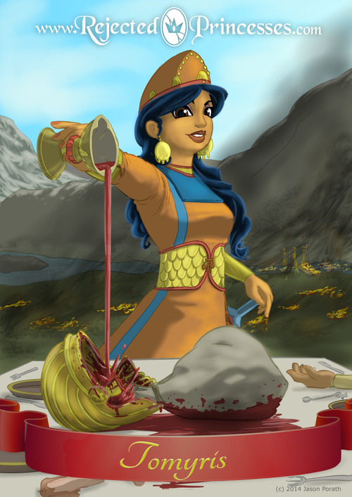
An NPR segment introduced me to a really cool art project.  Rejected Princesses puts a Disney spin on real-life women who were heroines or villains.  Jason Porath was a Disney animator.  One day, he and his buddies were sitting around, talking about how Disney would portray women that were too brave, capable, deadly, or otherwise too awesome for the typical princess role.  Disney, of course, isn't doing any stories on women who were Russian tank commanders, leaders of ancient fighting forces, or British spies.  So now Jason is doing it.


This attractive young lady, Tomyris, for example, was a widow in what is now Kazakhstan.  When the leader of the world's largest empire tried to marry her to expand his empire, she spurned his advances.  When he tried to take over by invading, she mustered up an army, kicked his ass, cut off his head, and publicly defiled it so badly that her name was a household word for centuries.  Not exactly Disney's idea of a pretty young thing who needs a prince to take care of her.

These images are well-researched.  Tomyris' outfit is authentic, as is the helmet of the defeated, decapitated, and defiled emperor, and so is the landscape.  Jason really knows how to tell a story with his images, something that I can really appreciate but cannot do nearly as well as he does.

Jason posts a new story every week.  I'm still digging through all the cool ones that he's already done.  Go take a look and check it often!

Saturday, August 30, 2014

Landscape Studies

I mentioned a while back that I've started to study landscapes.  There are several reasons.  One, I ran into a creative wall while trying to do my "Survivor" series.  I was stuck and couldn't find a way forward.  Doing something different for a while is usually a good way to work around a creative block.  A second reason is that I wasn't able to spend multiple days in a row in the studio, which is what is necessary for my creative juices to really get rolling.  (Are those two reasons related?  Ya think??)  A third reason is that I'm pretty bad at landscapes.  I rarely do them, so I'm not very good, and since I'm not very good, I rarely do them.  Maybe it's time to break the cycle.

So I tried a couple of landscapes on my own and, as you might guess, the results were pretty awful.  No, you may not see them.  So I started studying how other painters created landscapes.  Eventually, I found a really good guide on the subject.  Landscape Painting by Mitchell Albala is very thorough.  It is intended for artists who are already have a bit of experience.  It discusses plein air and studio work, equipment, color and values, site selection, light, and much more.  My copy is now marked-up, highlighted, and complete with paint smears from testing out what he discusses.  I've had other landscape books before, but none of them come close to Albala's book.  Rather than say "here's how to paint a landscape", Albala discusses the things you should think about and different approaches you can use.  In other words, he gives you the tools to develop good landscapes in your own style.

To put these lessons into practice, I set my French easel up outside and copied a number of works that were in the book or in a recent issue of Plein Air magazine.  Copying other artists' work is a time-honored tradition.  You learn a lot when you have to focus on something for an extended period of time, including how the picture was composed, an appreciation for the colors used, how the artist might have achieved success, where the weak points are, and so on.  All of these paintings are about 7 1/2" x 12" on gessoed and toned watercolor paper.  Why not panels or canvases?  Because I'm being a student again, and a lot of my work will be crap, and it's easier to tear up a piece of paper than a panel.

Each of these was done in two steps.  First, I copied the painting in one session, outside.   A day or two later, I critiqued it in the studio and then went over it again.  In every case, the first try was maybe an okay start, but totally unsatisfactory as a finished painting.  It was maybe a 50% solution.  And in every case, the end result is not something I'd exhibit, either.  Not only is it a copy of somebody else's painting (unethical to call it mine, which is why all these are unsigned), but none of these are completed to the level I would want.  They're maybe 80-90% solutions.  But that's fine, because I learned what I needed in each exercise.


This is a copy of Elk Creek by Jay Moore, from Albala's book.  Albala says that he's always asking his students "What is your painting about?"  Too many times, novice painters are just painting whatever is in front of them with no idea what the focus of the painting is.  I'm guilty of this, too, which is a big reason most of my landscapes have been junk.  But every painting should be about something, the central idea that everything is arranged around.  In this case, the central idea is the beautiful golden glow on the field.  Moore framed the gold with muted greens on the top and bottom.  The creek on the lower right has small areas of strong blue that are complementary to the golden-orange of the field and therefore enhance the gold.  There's great depth to the work, achieved through the overlapping hills that recede in the distance (and with atmospheric perspective, they get lighter and bluer as they do).  One thing I noticed when I pulled this off the easel was that I need to ensure the painting surface (paper, panel, whatever) is level when I block it in.  This one was crooked both times I worked on it!


This is a copy of Oak Creek Passage by David Santillanes.  In contrast to the painting above, which is bathed in late afternoon light, this one is in a deep forest with subdued lighting.  Most of the edges are very soft and colors are muted (actually, the colors in the original are more muted than my poor copy).  This image required a very different approach than my usual, very literal, one.  I basically scrubbed in large areas of muted warm tones in the top third (where the trees are) and down the course of the creek, then scrubbed in muted greens for the ground cover to the left and right.  Then I gradually developed the forms: the vertical trees, the round rocks, and humps of green grass.  My first go-round resulted in very little variation in the greens of the trees and ground cover (both in the range of greens and in their values).  Pretty blah.  So in the second round, I punched up the value differences (darker darks and lighter lights) and the color differences (warm and cool greens, strong and muted colors, shots of burnt sienna, and a very few touches of blue).  The end result is nowhere near as good as Dave's, of course, but it was a good learning experience.


This one's a copy of Where the Rabbits Are by Marc Bohne.  It's a little more successful in person than in this image.  My first cut at it had little depth, the bushes weren't dark enough, there wasn't enough color variation, the road was too light, and the tops of the bushes on the right, which were caught in sunlight, had no glow to them.  I worked on all that the second time.  The shadowed parts of the bushes are now much darker (more mysterious, more of a coherent shape), the road now appears to be out of direct sunlight (it's a little darker, with both cool and warm that give it the "beachy" feel), and the ground has more color variation.  The parts of the bush that are hit by the late afternoon sunlight are still unsuccessful.  Marc nailed it in the original; my copy failed.  But still, I got a lot out of this exercise.


This is a copy of Skagit River Dike, North by Mitchell Albala.  This was a plein-air demonstration project in his book.  My first attempt at this came up with the same green, just light and dark versions, over much of the painting.  I thought I was giving it some variety, but two days later, after it had dried some, it was clear that it was almost the same green.  Not only that, but the whole thing lacked value differences.  One reason was that I had used toned surface that was too dark.  It was a mid-value warm gray.  I tend to paint thinly, so my paint didn't have enough body to sufficiently cover the tone.  Lesson learned (at least for me): use a much lighter initial tone on my painting surfaces.  In the second round at this, I punched up the lights and darks and played more with the greens.  For all these greens, I used four colors: ultramarine blue, cobalt blue, cadmium yellow light, and yellow ochre.  Occasionally I used a touch of terra rosa to mute the greens, but just a touch.  The bottom line is that you don't need a lot of tube colors to get a wide variety of greens.


This one is a copy of Tower Shadows by Russell Case.  This was fun because Russell really played up the blue in the shadows.  I'm very literal, so I would not have used such strong blues (various combinations of ultramarine blue and cobalt blue, muted with burnt umber or burnt sienna).  But now that I know it works, I'll do it more often.  My first effort was actually too blue: the warmer, sunlit areas were just cool grays.  In the second round, I warmed up the sunlit rocks and put some warm colors into the shadowed rocks.  In Russell's original painting, the edges of the shadows were strong blue; the warm strokes were buried in the middle of the shadows.


This is a copy of Willeo Misty by Marsha Savage.  It was an interesting exercise because the original is done in pastel.  Pastel allows the artist to get very strong colors at all value levels: strong dark blues, strong light greens, and so on.  Oil paint doesn't allow that, especially when you're working with a limited palette.  As with a previously-discussed exercise, my first cut at this didn't have the value range it should have, the greens had too little variation, and I totally messed up the water.  In round two, I lightened the hill in the background, made the shadowed areas of the trees bluer and darker, with the lighted areas yellower and much lighter.  Marsha was able to use strokes of strong color everywhere with her pastels.  I forced myself to put in a lot of strokes of my primaries - in other words, in the shadowed areas of the trees, not only did I use a mix of ultramarine and cad yellow, but I also put in strokes of ultramarine alone.  And I played up some of the blues in the reflections in the water.  Again, this is something I would not normally have done, but copying her work forced me out of my comfort zone.  I had fun with it and learned some new stuff.

So what's next?  I think it's time to head out into the countryside and start making my own landscapes.  Maybe I'll post some here.  And if they're junk, maybe not.

Tuesday, August 26, 2014

Artwork Updates

A few weeks ago, a cousin sent me a box of old family photographs.  Her father passed away several months ago and she's been sorting through all his effects.  These photos were of my mother, her parents, and her maternal grandparents.

One of the photos grabbed my attention.  It was taken a few months after I was born, when my parents visited my mom's family to show off their new addition.  They handed me to my great-grandfather, Ruben Bell, and snapped this picture:


I was really taken with Ruben's expression.  This was a man who led a hard-scrabble life.  He had been a sharecropper in rural Tennessee and had buried four of his six children early.  Now here he was, in his 70's, with his first great-grandchild.  This was the only time we were together, though.  Ruben died on Christmas Eve a few months after this picture was taken.

Being and artist, I had to do something with this image.  So I grabbed a canvas and here's the result:

Ruben and Me
Oil on canvas, 24"x18", 2014

I liked the fact his face was in heavy shadow, yet you could still get a strong impression of his emotions.  The background had to change a bit.  My posture in the photo was inelegant, to say the least, so it had to be modified, and while I was at it, I changed the outfit and added a blanket.  This may look like a simple copy of a photo, but trust me, it isn't - and it was harder than it looked.  Sometimes things come together quickly and other times they don't.  I wouldn't call this one a "fight", but there were some aspects that required, shall we say, a considerable amount of heated discussion between me and the damn paint.  But it works and I'm happy with it.

There are quite a few other photos in that box that are crying out for similar treatment.  I might do a series of paintings based on them.  Sounds like a bit of fun!

In addition to this painting, I've been going to life drawing sessions when I can.  Here's one from last night:


The Monday night sessions that I go to are two hours of very short poses, lasting only one to three minutes each.  That's quite a challenge in itself, as you have to get the essence of the pose very quickly.  If you don't get it, tough luck - we're already on the next pose.  It's actually a lot of fun.  Last night, our model was an aerial gymnast.  She spent several years doing aerial acrobatics with the circus.  She was the one who had the long streams of colored silk that she'd wrap around herself and do all kinds of flips and rolls 30 feet in the air.  Last night, though, she was only a few feet in the air but still doing some amazing things.  Like the splits in this quick sketch here.  Every try to draw somebody that's hanging upside down?  It's quite difficult.  Since everything is turned  around and coming at you from unusual angles, you have to actually look at what's there, understand it, and put it down on paper.  If you're used to drawing figures, you often draw automatically, because you're used to the eyes being this far above the nose, which is this far above the mouth, with a chin that's formed in a certain way.  When everything is reversed, your brain goes "erf?" and short-circuits, and you have to connect your eyes to your drawing hand.  Which should be connected anyway.  So this was a great exercise.  Go find yourself an aerial gymnast and draw her/him - you'll learn a lot!

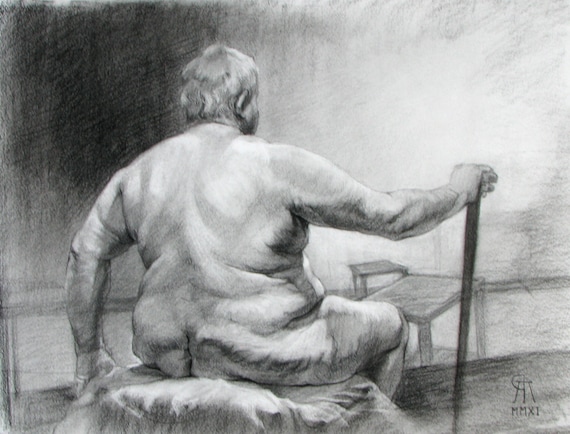
Other life drawing sessions are more traditional.  I went to one that had traditional 20-min poses.  This allowed me to work with charcoal and Conte crayon again.  I hadn't used those in quite some time, so I was a bit rusty, but it came together again after a bit.  Here's one of sketches I did:

B's Back
Charcoal and Conte crayon on toned paper, 13"x10"

I've got this one in my Etsy shop now, along with quite a few others.

So that's a sampling of what I've been working on lately.  Hope to have more to show you soon.

Wednesday, August 13, 2014

Shows and Color

Has it really been two weeks since I last posted?  Evidently it has.  Sorry for the absence, as if anybody noticed.  Most of the absence has been due to real-world activities.  But I've been kinda/sorta busy in the studio as well, and have a few things to report.

First, my "Faces of Afghanistan" artworks are on exhibit at Lees-McRae College in Banner Elk, North Carolina.  This was one of those things that came together quickly.  Basically, I was talking with one of the art teachers about the drawings.  He asked, "How long would it take you to get them ready for an exhibit?"  My answer: "Oh, maybe two hours to get 'em all packed up."  That was on a Saturday.  A few days later, on Wednesday, we hung the show in the Student Center.


Here's part of the show.  More is on the opposite wall.  "Faces" will be up until September 26.  Since it's in the Student Center, it's open every day, so go see it if you're in the Banner Elk area.

Later that week, I got some more good news.  "Faces" will be shown at a college in Ohio in November.  More details to follow.  I'm really excited to have the drawings shown up north!

Meanwhile, I've continued to work on how I apply paint to canvas.  In one of my earlier blog posts, I posted a picture of this cloudscape study:


It was pretty ... meh.  Fairly accurate but about as exciting as a roll of toilet paper.  So I revised it:


That's better.  Still not great, but a big improvement over its "Mr Blah" earlier stage.  I based the revisions on some ideas from some of my reading.  And I'm still reading: just started another book about color and light.  Neither one of those topics is a strong suit of mine, so any improvement is welcome!

Monday, July 28, 2014

A Gallery Closing


Bella Vista Art Gallery, in Biltmore Village, Asheville, closed today.  Bella Vista was the only gallery that carried my artworks.

Its closure wasn't a surprise.  The owners, Glenn and Christin, had told me several months ago that the gallery would close at the end of July.  Unlike most galleries, its closure wasn't due to lack of sales.  Christin and Glenn were from New Orleans.  They wound up in Asheville after Hurricane Katrina devastated Louisiana and destroyed their gallery.  They rebounded, opening Bella Vista in the River Arts District and then, later, moving to Biltmore Village.  And they turned it into one of the best galleries in Asheville.  They had really good artworks, beautifully displayed, and cared very much about presenting the artworks well.  Bella Vista survived the economic downturn of 2008 and was still doing well up until today.

Family issues were what drove the decision.  Glenn and Christin still have family in Louisiana, and it was time to go back and be near them.  So they made their plans and are leaving Asheville on a high note.

For an artist like me, Christin and Glenn were the gold standard for gallery owners.  Christin was the artistic director and primary sales person; Glenn provided the back-room support.  Christin has a sharp eye for artworks.  She educated me about buyers, what different people look for, and how they might respond to my works.  She focused on my drawings and etchings.  When she took one of my works, she framed it beautifully and presented it in its best light.  Even when my sales were slow (meaning more than a year between sales), she never wavered.  "I like your work, it's good, and it will sell!"  And, eventually, it did.  Whenever Christin sold one of my works, she was on the phone to me within ten minutes, excitedly telling me about the person who bought it, and why.  When I was deployed overseas, she shot me an email.  Christin and Glenn were more excited about the sales than I was!  And even though our contract only called for them to pay me after the end of the month, they always sent a check within just a few days.  Amazing.

I've been with galleries that just used my work as filler, or forgot who I was even though they had three of my paintings, or tried to tell me what to paint.  Glenn and Christin, on the other hand, were my trusted partners.  I'm very sad to see them go.  It's the best thing for them, but not for me and all their other artists.  They will be missed.

And after my experience with Bella Vista, I'm really spoiled when it comes to galleries.  

Sunday, July 20, 2014

Art Studies

I've continued to do mostly studies about art, rather than making new paintings.  Work and home have demanded a lot of my time.  I've got a couple of new clients for my consulting business, and I'm trying to make sure they're happy.  And at home, a combination of ongoing projects and decent weather has required a lot of labor outside.  We had a new propane tank installed in the yard, which meant they had to dig a big hole to bury it, which required me to smooth over the ground, spread grass seed and fertilizer, cover it all with straw, and restore a stacked rock wall.  Sounds simple but it required a lot of time and I was a whipped puppy at the end.

So the studio has gotten short shrift lately.  I've used my limited time to work on several different studies.  One of them is landscape.  I've continued to go thru the landscape book mentioned in a previous posting, taking lots of notes, and learning a good bit.  One of my studio efforts was a cloudscape.  Here's how it turned out:


Great art?  Hell, no.  But it's paint on canvas and gave me a chance to work with the play of late-afternoon sunlight.  I've always loved looking at those big summer afternoon thunderclouds.  Sometimes the light catches them just right and stops me in my tracks.  But painting them is a difficult thing to do.  Painters work with a very limited range of colors that reflect light, whereas a thundercloud and the surrounding sky comprise an infinite range of colors and light.  With this particular study, I looked at how the range of colors in the sky (an ultramarine in the upper left corner, to a light green in the bottom right), as well as the range in the cloud (bluish purple shadows, light rose highlights near the bottom, gradually shifting to orange and yellow up high).  The mountains are, to me, a disaster, but that just shows what I need to focus on next.  Lots of lessons learned here.


I've been going to sessions with a model on Wednesday evenings.  Last week was my third session.  We had a lovely young lady who took a pose leaning against the wall.  She was very tanned and athletic, which gave her skin a rich warm glow, and the strong lighting gave sharp contrasts in light and dark.  I was pretty happy with the way this study turned out.  Titled "Megan Standing", it's now up in my Etsy gallery.  With this study, I put into practice some of the things I've picked up from my figure studies.  Specifically, I do an underpainting using only burnt umber.  This lets me work out the composition and light/dark structure.  Once it looks acceptable, I go in with a very limited range of colors.  This one used primarily yellow ochre and cad red, with a little bit of cobalt blue in various places, some ultramarine in the very dark darks, and a tiny bit of cad yellow in some of the highlighted areas.

Last week, I visited one of our local used-book stores and found a thick book on Anthony Van Dyke.  I never knew much about him, besides that he could paint a helluva fine portrait.  I've been going thru the book and studying the images, taking notes on the compositions, colors, metaphorical representations, and other things as they pop into my head.  My method of taking notes is to do a thumbnail sketch of the image and then scribble things down as they pop into my head, in a stream-of-consciousness way.  Here's a page from the notebook:


After this afternoon's session, I have quite a few things that I want to try out in the studio.  Lots of lessons learned, I think ... if I can remember them!


Thursday, July 17, 2014

Exhibit Review

Aperture Magazine published a review of the show I was in at Western Carolina University.  "Remote Sites of War" was a 3-man show curated by David Brown, the Director of the Fine Arts Museum there.  The other two artists were photographers Todd Drake and Chris Sims.  The show ran from April 10 to May 30 and the review was just published today.  Here's the link:

http://www.aperture.org/blog/remote-sites-of-war/

Monday, July 07, 2014

Early July Update

It's been busy times here since my last post.  Very little of it has to do with art.  We finally had our heat pump replaced.  That was a big deal, about 3 days worth of work for the crew from Bullman Heating and Air, but they did a really good job.  The new system pumps more air than the old, and it cooled the house down quickly, so we're happy.  The next stage will be next week when we have the propane guys come out and install a big tank.  Since our heat source in the winter will now be propane rather than electricity, it will be needed.

One of my business clients had a big project come up, and I spent about ten days going full-bore on it.  No studio time for this boy.  But we got it done and met the deadline.  And then I was able to catch up on other things.  Art, for instance.

As I mentioned in my last post, I'm going through another stretch of training myself in better painting techniques.  I had studied some classical figure painting techniques and applied them to a couple of copies of master paintings - one by Odd Nerdrum and another by Rembrandt.  Subsequently, I did a couple of life studies.  One will never, ever, see the light of day again.  The other was done from an old drawing session and it actually turned out okay.  Here it is:

Blue Shawl
Oil on linen panel, 20"x16"

This was done in a classical style, with warm underpainting and glazes on top.  I learned a good bit from this exercise.  The painting is now up in my Etsy gallery.

In addition to working on techniques for the figure, I'm also looking at landscapes.  This is a subject that I've typically avoided.  I don't do landscapes well, except for a very few that were really "portraits" of specific things.  And since I don't do landscapes well, I just don't do them.  But that's not a responsible attitude to have if I want to consider myself professional.  So it's time to learn how to up my game with landscape paintings in addition to figure paintings.

To that end, I'm overhauling my outdoor kit.  My French easel is permanently loaded now with a decent selection of paints, brushes, and other equipment.  And it's in my truck, where it's readily available when I can get away from work.  I've done some plein-air studies that, like the figure study mentioned earlier, will never see the light of day again.  But that's fine: you gotta whiff a lot of pitches before you start getting some hits.

And I'm doing some reading.  One of my plein-air painting friends told me to not worry about technique, just paint with passion and it'll happen.  Well, no, it doesn't, not for me.  I'm the kind of guy who needs a structured approach.  When I have no idea what I'm doing, and I'm winging it, the result has invariably been a disaster.  But if I understand the approach, then I can take deliberate risks with when and where to wing it.  And it generally works out better.  The result may still be a disaster, but at least I have an idea about what happened and can learn from it.

Oh, yeah, the reading.  I got the book Landscape Painting by Mitchell Albala.  I'm working my way through it and finding it to be quite good.  His style of working, from color choices to drawing to basic approach, is very similar to what I've already worked out for myself.  So I have pretty good confidence that the things I'll learn later will mesh with what I'm already doing.  Good stuff.

This doesn't mean I'm turning into a landscape painter.  Far from it.  But I do feel that I have to be reasonably competent in that genre.  So it's time to get to work and learn something.  Hopefully, by the time I make my next post, I'll have a landscape or two that are worth showing.  Or not.  Don't hold your breath.  But sooner or later, you'll see some here.  

Saturday, June 14, 2014

Studying the Masters

In my extremely limited studio time recently, I've been focused on learning better ways to put paint on canvas.  You may recall (if you're one of the 3 readers who've been with me a while) that last fall and winter, I stopped all new work and focused on re-learning the basics.  At least, high-quality basics.  I studied the techniques of several artists, took a workshop, got a DVD from a really strong painter, did some studies, and finally applied it all in a new painting, "Saddle Up", which was featured in a recent post.

A couple of things have blocked my development of new paintings.  Outside life events in general over the last month (the heat pump, the car, the cat, and lots of other nitnoid things) have demanded an inordinate amount of time.  The other is that my consulting business has been very busy in an unpredictable way lately.  Two clients have hit me with some very time-intensive projects.  Fortunately, they didn't come at the same time, but between the business and life events, I haven't been able to spend a sufficient amount of time in the studio to think about new works.

So I've focused instead on developing my techniques.  I got a new DVD on making a "classical" portrait from Robert Liberace.  The earlier one I got from him was on making an alla prima portrait - meaning a portrait done in essentially one sitting.  The "classical" approach is different in that it is done by carefully building up the painting in layers over a period of time.  This approach seems to fit my way of working: it's slower, more deliberate, and really rich when done properly.

Robert has an extremely well-developed sense of color, much better than mine can ever be, because my eyes just don't see color the way his do.  But that's okay, even very restricted color selections can have strong impacts.

Let me drop back a bit here.  For many years, I had no understanding of how color worked.  You mix one blue and one yellow, and you get a bright green; you mix a different blue and you get a dull green, and I never understood why that happened.  It was like I was supposed to memorize all the different color combinations.  Well, anybody that knows my memory knows that just won't fly.  Finally, in the mid-90's while studying at Maryland Institute College of Art, I was exposed to the book Blue and Yellow Don't Make Green, by Michael Wilcox.  At last, here was a reference that explained why mixtures made strong or muted colors.  Rather than making me memorize things, now I had a logical understanding of how to deliberately select and mix colors for specific effects.  Finally, I could paint!

But there were also some side effects from Wilcox's book.  (There are always side effects to everything.)  One was that my palette was now made up of a lot of strong colors such as cadmium red, cobalt blue, and phthalo green.  When you use strong colors, they tend to stay strong.  In painting a face, for example, your reds tend to be RED, your yellows YELLOW, and so on.  It's like driving your car with wild swings at the steering wheel and going all over the road.  Strong colors are great, but learning how to use them with subtlety is difficult.

In some of my studies recently, I've seen that many of the great artists used very restrictive color choices.  Sorolla, for example, used primarily yellow ochre, cadmium red, ivory black, and white.  Occasionally he used a small touch of a blue, but not often.  Yet he was able to achieve remarkable skin tones.  So I did a study using the Sorolla palette and, while the painting itself is kinda blah, I learned a lot.

The new Liberace video built on that approach.  While his colors were definitely more varied and stronger than Sorolla's selection, Liberace used them with restraint.  He mixed up a basic skin tone, then made a couple of variations on it, one warmer and the other cooler.  The differences in color temperature (meaning how warm or cool it is), value (how light or dark it is), and intensity were generally very small.  Certainly much smaller than my clumsy attempts.

I decided to put Liberace's approach into practice.  Rather than copy the painting from the DVD, I decided to copy an Odd Nerdrum portrait.  Here's how it turned out:


This was an interesting and fun exercise.  Nerdrum and Liberace don't paint the same way.  They use the same fundamentals (underpainting, layers of color, and so on) but their color choices and methods are different.  Liberace uses burnt umber for an underpainting, which is a warm muted brown.  Nerdrum uses a blue-black for an underpainting, which is much cooler.  Generally, blue is not a color you want in a face, but Nerdrum's is very muted and he makes it work. So, by using one painter's approach to copy another painter's portrait, I learned a lot.

In fact, I had so much fun, I did it again.  This time, I copied a Rembrandt self-portrait from the cover of The Rembrandt Book by Gary Schwartz.  Here's the result:


What I learned from this one is just how amazingly observant and good Rembrandt was.  There was no attempt to pretty himself up.  He showed all his wrinkles, pits, and sags.  There was no overstatement of anything - all his strokes are small, efficient, accurate, and lively.  As I was working on his forehead, for example, I was blown away by his attention to detail in each and every fold.  Usually, "attention to detail" in a painting means that it's way overworked and the artist should have stopped long before he really did.  Not with Rembrandt - with him, the detail provides additional support for the overall story in the painting.  My copy is just a poor cousin to the richness, vitality, and life in the original.

But still, my copy is a decent painting.  I learned a lot about subtlety, paint application, and a bit about "trusting the paint".  I'm going to make another copy or two.  And then I'm going to do some new paintings using what I've learned.  Can't wait!

Friday, June 06, 2014

Lament
Oil on canvas, 60"x60", 2006

"Lament", one of the paintings from my Meditation on War series, is now in a curated exhibition in Tipton Gallery in Johnson City, Tennessee.  The show is "Colors of Aspiration: The Flag in Contemporary Art".  As the curator, Karlota Contreras-Koterbay, stated:

"The exhibition features works by contemporary artists who employ the symbolic image of the flag to address social issues and its manipulation as visual dialogue.  The American flag has been a potent symbol of patriotism as well as powerful icon for social agency.  Artists, most prominently Jasper Johns, have employed the Stars and Stripes in various configurations and materials to pursue artistic ambivalence and encourage discussions in the nature of art.  The artists in the exhibition continue on this trajectory."

I painted "Lament" in 2006, when the wars in Iraq and Afghanistan were getting worse.  I was angry about how the administration had led us into two wars, and angry about how so many people callously disregarded the costs.  I wanted to make a statement that reminded people that, when you go to war, there is a tremendous cost to pay.  People die.  People get hurt.  Irreplaceable things are destroyed.

But people don't want to think of that at the start of the war.  Then, it's parades and speeches and a grand adventure where our boys are going to go kick the other guys' asses and be home in time for dinner.  Only it never turns out that way.  As our forebears learned in the Revolutionary War, and again in the War of 1812, and the Civil War, and the Spanish-American War, and World War 1, and World War 2, and the Korean War, and Vietnam, and any number of "police actions", it never goes as planned, and Johnny doesn't always come marching home again.

We need to be reminded of that anytime our politicians start talking about sending in military forces.  It's always, always, going to be worse than they say.


Monday, May 26, 2014

Of Cars and Cats and Broken Things

Real life has a way of interrupting all the things you really want to do.  So it has been for the past two weeks around here.

It started with a cat.  One of our neighbors had a cat that they never paid attention to.  They never took her to the vet, never gave her shelter, and never fed her.  Last winter, when we were down in single-digit temperatures, the cat showed up at our house looking underfed and desperate.  We were reluctant to take her in the house, but we made up a warm and protected shelter for her, fed her, and on the worst nights, brought her into the garage.  So she adopted us and we named her Bella.  But Bella was also pregnant (the little hussy).  Eventually, she had the kittens.  We never discovered where they were, but she would come visit several times during the day and wolf down huge amounts of food and milk, then run off to take care of the kids.

Then, about two weeks ago, Janis spotted a tiny little face peering out from behind the ShopVac in our garage.  I went over and discovered three tiny, scared little kittens.  A fourth was hiding behind some shelves.  Bella had brought her children over to her safe haven.  The little things were still nursing and a bit feral.  Eventually, though, they got used to us and began exploring the garage.  (Actually, they took over the garage: we have to park the cars outside so we can come and go without disturbing the kittens.  Lord knows you can't disturb the kittens.)


We tried to find homes for them.  We managed to place one, but that was it.  So last week, well after they had stopped nursing and graduated to hard food, I took three of them over to the Madison County Animal Shelter.  They were a huge hit.  I was worried about their future, but the staff (great bunch of people) assured me that cute little kittens like these are quickly adopted.  That was good news.  Meanwhile, we've still got Bella and are temporarily watching the one kitten who's been spoken for, just until her new owner can pick her up.  And when the remaining little one is gone, Bella's going to go to the vet for the first time ever so she can get her shots and get spayed.  No more kitties for us!


About the time the kitties showed up, our Volvo got rear-ended by a 93-year-old guy driving a Cadillac.  We were sitting in a long line at a stoplight and he just wasn't paying attention.  Wham!  The front end of the Caddy was destroyed and our Volvo took a pretty good licking.  Fortunately, nobody was hurt.  Unlike the old guy in the Caddy, we were able to drive away.  It's been in the body shop for a week now and (hopefully) we'll get it back tomorrow.

Our insurance company had us go to Enterprise for a rental car.  These guys were clueless.  Totally.  I made arrangements to pick up the car the day after the accident.  When I got there, they had no idea I was coming.  Then they gave me a Nissan Frontier that was identical to our own except 6 years and 30K miles newer.  We arranged to swap it for a car early the next week.  Again, when I got down there to swap it, they had no idea that I was coming.  This despite the fact that I had called them 30 minutes prior to let them know I was on my way!  Of course, they didn't have a car ready, and after about an hour, they wound up giving us a Jeep Wrangler.  Now I'm not big on Jeeps - I think they're rolling antiques at this point - but Janis loves it.  So we've been driving a Wrangler for the past two weeks.

As we were dealing with kittens and cars, we had another rude surprise.  Our 16-year-old heat pump died.  Our trusted heating/cooling guys had been telling us for maybe three years that we should be prepared for it to go, and it finally went.  So we brought 'em out for an estimate for a replacement.  Well, it wasn't so simple.  The original heat pump was built into the attic in a way that is extremely difficult to remove.  It really shouldn't have been up there in the first place as our attic has no airflow and is hotter than all hell in the summertime.  And the heating/cooling ducts to the back half of the house are too small and too long to allow for enough air to circulate.  The bottom line: the new heat pump needs to go in the crawl space below the house, where it'll be cooler in summer and warmer in winter, and where the air ducts can be most efficiently routed.

That's the right answer.  It's also expensive.

So we've been working on a home-equity loan to pay for the new system.  It's a royal pain in the keister.  Because it's tied to the equity in the home, they want to know everything.  Everything about the house, the land, our income, you name it.  An unbelievable amount of paperwork.  Fortunately, our credit rating is pretty strong.  We should get the "good to go" sign in the next couple of days, but it'll still be a few weeks before everything is signed, sealed, and delivered.  Ugh.

And while all this was going on, our mower broke.

On the positive side of the equation, I landed a new client for my consulting business.  So I've been working hard to ensure I get off on the right foot with them.  It's taking a lot (a lot) of time, but so far, so good.

But this means that I've been able to spend about zero amount of time in the studio.  I've had a couple of art developments, but will save those for an art-related post.  Hopefully, by then the kitten will be at her new home, our new cat will be spayed, our Volvo will be back from the body shop, our lawnmower will be back from the lawnmower shop, our loan will be approved, the new heat pump will be in the process of being installed, and my new client will be happy.

Maybe then I can spend a day in the studio.

Wednesday, May 14, 2014

New Paintings

I recently completed two new paintings and wanted to share them here.

Saddle Up
Oil on canvas, 50"x40"
©2014 Skip Rohde

Saddle Up is about a friend of ours, Pete, who was a Marine in Viet Nam.  Pete was in some really vicious battles during his two tours there in 1968 and 69.  When I interviewed him as preparation for this painting, he said that he was still fighting some of those battles at night.  His wife said he normally sleeps only a few hours.  I tried to capture that experience here.  Pete was the one who came up with the title.  "Saddle up, ladies" was the call to the Marines to head out on patrol.


After the Patrol
Oil on canvas, 24"x30"
©2014 Skip Rohde

After the Patrol was done from a sketch I did in Afghanistan.  A group of soldiers returned to our base completely worn out from their day conducting a village patrol in 120+ degree heat.  These can be nerve-wracking in the best of times because you never know when an IED might go off, or when insurgent fighters might open up.  You're a walking target.  And this sergeant had been in charge of the patrol.

I feel pretty good about both of these paintings.  I think both manage to capture the feelings I was looking for.  There are one or two other paintings in the queue right now.  Hopefully, it won't be months before they're done!

Saturday, May 10, 2014

Artists on Etsy

Last month, I wrote a post about establishing a gallery on Etsy.  Since then, I've continued to add to it, refine the listings, and actually sell a couple of pieces.  My gallery currently has 62 items and I'll add some more this weekend.

Some artists cringe at the thought of putting their work on Etsy.  It has an image of a craftsy place for hobbyists.  I've found that's not necessarily true.  While, yes, there are tons of people who are hobbyists, and frankly a lot of the work is about the level of a hobbyist, there are actually some highly talented and capable professional artists there as well.  We're talking about people with bachelors and masters degrees in fine art, teachers at some of the best art schools in the country (Rhode Island School of Design, for example), and many who are just plain good.

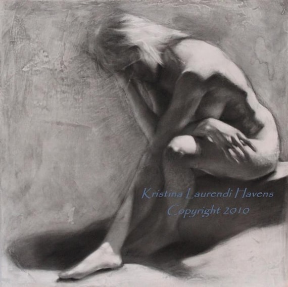
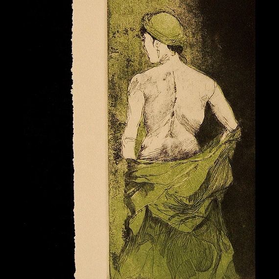
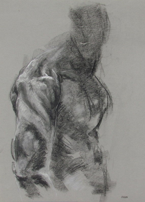
Etsy has a feature called a "treasury" list.  Members can put together a variety of "treasuries" of items that caught their eye.  I did one called "Outstanding Figurative Art on Etsy".  It links to really strong work by 16 different artists.  Here are some of them.


Kristina Havens does some beautiful classical figurative work.  She has an MFA degree and it shows in the quality of her drawings.  Kristina is actually the reason I've got an Etsy shop: she wrote an article on setting one up that was published in Professional Artist magazine.  It got me started on the project and I'm still following her advice.  Kristina's shop is Krystyna81.  She also has a blog.


I've been looking at Helen Gotlib's figure drawings for years.  This young lady really knows how to draw expressive figures.  And flowers, too.  She earned a BFA degree, has exhibited in solo and juried shows, and has worked the art festival circuit.  Her shop is HelenGotlib and her web site is helengotlib.com.


Derek Overfield is a beautifully expressive artist.  His drawings are gestural rather than classical, full of energy and power.  Derek, like the other two, has a degree in fine art, and has exhibited in numerous juried shows.  His Etsy shop is derekoverfieldart and he also has a website.


Rory Alan MacLean has a way with the figure.  This one, for example, is so strong and captures the weight and mass of the model beautifully.  He studied partly in the classical manner and also in school, earning a BFA.  I really like both his drawings on his Etsy shop (roryalanmaclean) and his oils on his web site.


Ute Rathmann is a young lady in Germany whose work continues the spirit of German expressionists.  She has a very vibrant style with a great sense of composition.  I have no idea what her background is since her bio is in German, but it's clear that she's prolific and exceptionally skilled and talented.  She works primarily in drawings, etchings, drypoints, chine colle, and related media.  Her Etsy gallery is uterathmann.

So there are five of the 16 artists I've found.  If you like figurative art, go take a look at my list and browse through.  I guarantee you'll find something that will catch your eye.

Tuesday, April 29, 2014

Studio Progress

Welcome to Sarajevo
Oil on canvas, 24"x30"

My painting Welcome to Sarajevo is in the "Mayhem" juried show in Arlington, Virginia.  "Mayhem" is this month's exhibit at Gallery Underground in Crystal City.  The theme is mayhem and chaos of all sorts: conflict, domestic strife, burnt breakfast, rush hour traffic, you name it.  My painting is a quiet mayhem, the aftereffect of really violent actions, so it will be interesting to see how it is received.

Welcome to Sarajevo was an important painting for me.  It marked a shift from my political satire series to something that I hoped would be more significant.  The satirical paintings were fun to do, but there were two serious issues with them.  One, they required that I get really angry about something, usually about politicians who were running the country into the ground.  Getting angry was key to getting the vicious, snarky, and cutting commentary that came out in the paintings.  After a while, getting angry was just draining, and I needed to get away from it for my own sanity.  The other issue is that satire is very time-sensitive.  I found that a lot of the works were irrelevant after several months.  The issues changed, people left, and suddenly a painting that I worked on for weeks no longer had anything to say.

So I started the "Meditation on War" series.  War is, unfortunately, timeless.  It will always be with us in one fashion or another.  The paintings focus on the aftermath of combat, the things and people that are left.  The works were initially a counter to the rabid pro-war drumbeat that was part and parcel of the Iraq invasion.  If you want to go to war, you ought to think about what the consequences are going to be.  People die.  People get hurt in ways that affect them for the rest of their lives.  Stuff gets torn up, often stuff that can't be replaced.  Incredible amounts of money and resources are wasted.  And it always goes on for longer than you think it will.  I'm not anti-war or anti-military: there are times when we really do have to go to war to stop something worse from happening.  Desert Storm was an example.  But wars we don't have to fight shouldn't be fought.

It looks like I'll continue to do paintings for this series for quite a while.  I just started a new one today.  Didn't really mean to, but there it was ...

Yesterday I finished and signed the painting about my friend Pete, who was a Marine in Viet Nam.  It's done, finally, the first in my new series of paintings about survivors.  Now I need to come up with a title.  And also yesterday, I painted over the other artwork-in-progress from the survivor series.  It wasn't going anywhere except downhill.  Gotta start from scratch on something I've been working on since September.  It will get there, I just don't know how or when.